The Kitchen Designed by Moore House Design // Photography by Erin Little // Featured in House Beautiful
Our Belgian midcentury project introduces our modern European take on a 3,100 sq foot gambrel colonial-style home primely located in Rhode Island, on one of Aquidneck Island’s most coveted ocean-side avenues. Like many of the New England based projects we take on, this house had been built in the 80s, filled with a lot of builder grade finishes and half finished renovations leaving a rather fragmented starting point for our clients. This project's intention was an effort to sew the fragments back together whilst creating a greater connection or purpose Creating a sense of why for the home and its stewards.
Our clients loved American Mid Century Modern but the cottage is located in a very coastal town of New England nestled among capes and colonials. This project although was built in the 80's didn't come with much character and the clients wanted her to exude their love for mid century flare whilst feeling quintessential new england. Here at Moore House Design when we start to take on a new project, I spend a period of time at the beginning diving into research. I want to make sure anything that we are changing or adjusting can equally add to the homes integrity as well as my clients.
I knew my clients wanted something comfortable for their family to grow but also give nods to crisp nostalgic references of their love for mid-century elemtents. I personally am more partial to European mid century silhouettes - I referenced a lot of lines and perspectives of Vincent Van Duysen and the materiality of Karin Draaijer, both wonderful Belgian designers. I then studied a lot of the silhouettes of the European mid century from the 50-70s. From Italian to Swedish to English and layered in my love of vintage textiles and materials.
The Living Room Designed by Moore House Design // Photography by Erin Little // Featured in House Beautiful
Building a home in connection to craft & artisans
So many of the 1980’s colonials that were built on the east coast were done so unintentionally and they are usually lacking history and connectivity to craft. Here we wanted to go back to the beginning — working with natural earthen materials crafted by local artisans from tadelakt, to fine cabinet making, furniture joinery, hand forged iron work and detailed custom upholstery to embark on purpose for the home.
The major pain points our client felt were mostly regarding the first floor—aesthetics felt forgotten and flow was not in line with how they lived as a young, fun family. The original galley kitchen was severely lacking in space and function, especially considering our client’s career as a private chef. To rework circular flow, we focused on shoring up the internal structural components in spaces like the staircase, half bath, kitchen and fireplace, so that a creative solution to our clients' liveable area was provided. We also opened up the entry vestibule by recentering the front door to give the first floor balance and breath and even closed up a two story vaulted space that not only added space to our clients home but actually created a more expansive feeling to the first and second floors.
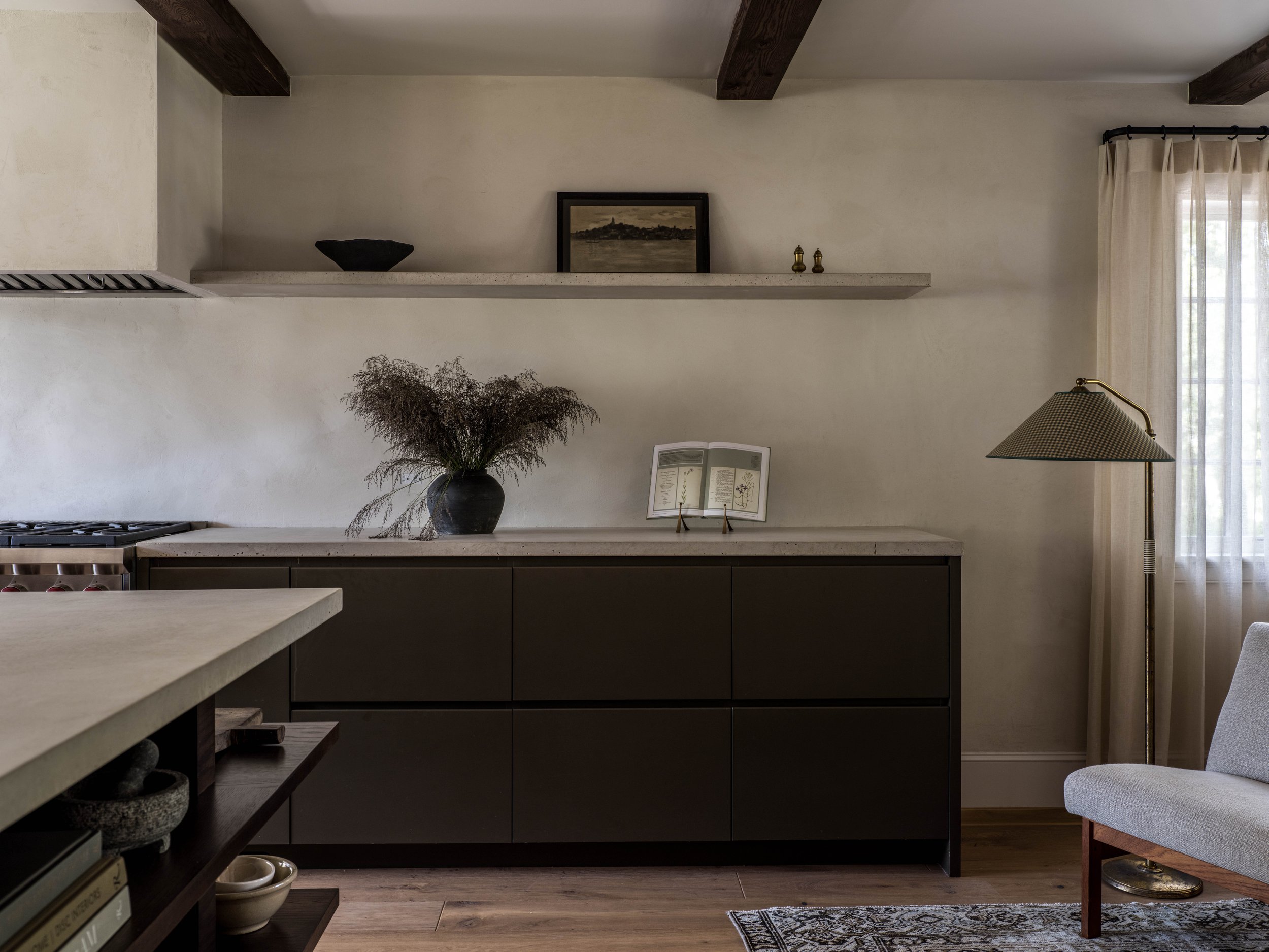
Our integrated Custom Coffee bar & pantry. We designed the hardware to be integrated into the cabinet faces.
Integrated custom cabinet with walnut interior drawers & A hand poured concrete countertop.
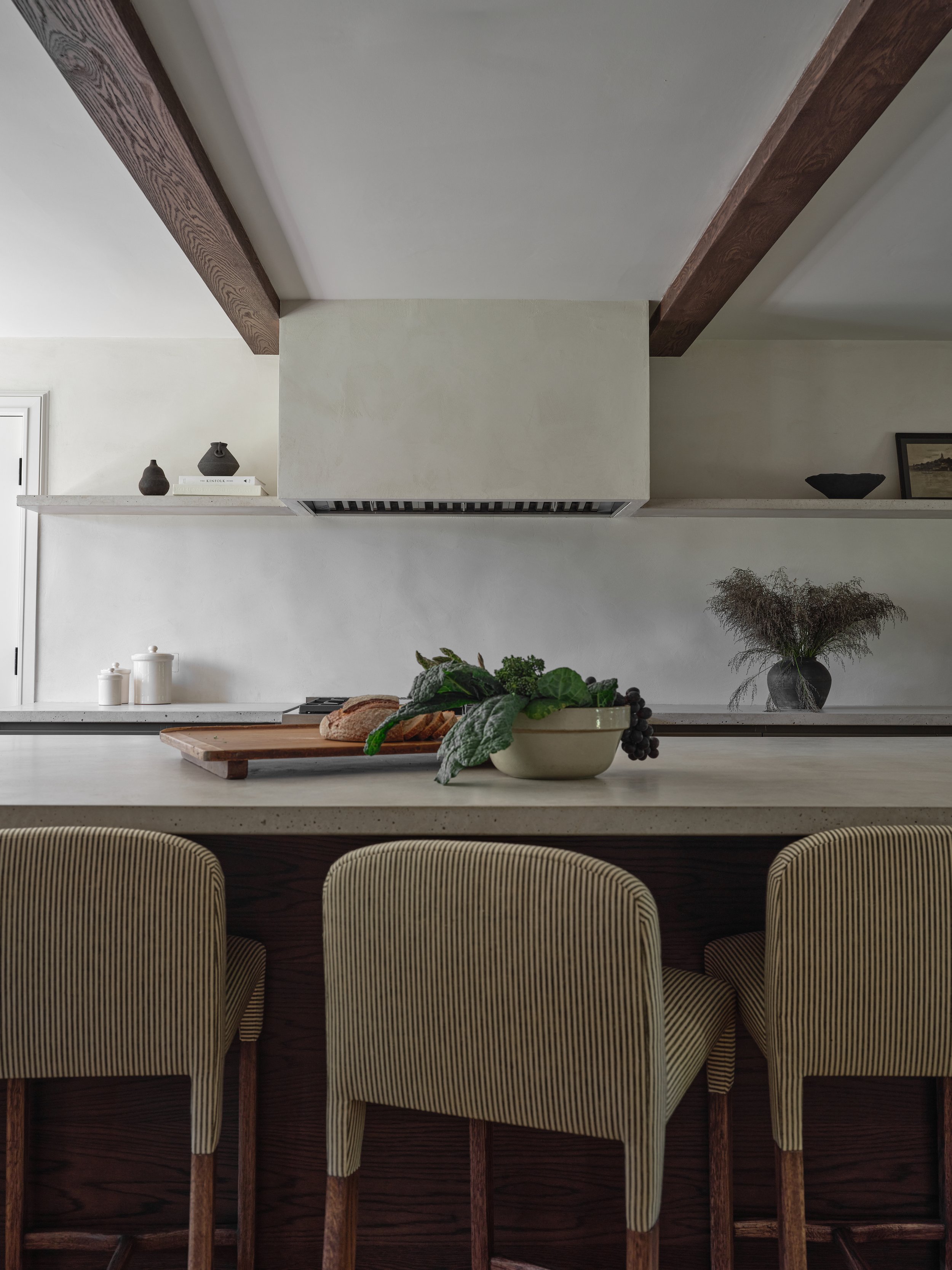
4 x of our custom Roweam Wocott Stools
The Kitchen
The Kitchen needed to be a large expansive space for our clients family to work and play. A mum of two and a private chef, our clients love to cook and craft together as a family. We wanted the space to feel both utilitarian as well as an extension of the living room so we crafted a smaller Kitchen lounge and a play on a Pierre Jeanneret Pigeonhole Desk from the 1950’s.
Something that is work and entertaining at the same time. Layered in Plaster, Hand poured concrete, plain sawn stained oak and vintage malayer rugs and adorned with french and european collection of curiosities in the kitchen sourced from Blair and her team on their travels. 4 x Wolcott Stools from Roweam were custom made in Rose Tarlow fabric.
Custom 10’ island designed by Moore House Design in the Style of Pierre Jeanneret Pigeonhole Desk from the 1950’s
Integrated double dishwashers on either side of the sink
Accounting for a larger kitchen meant the whole first floor needed to be brought back to the bones, including the staircase to the second floor. Although we don’t love to fully gut homes for sustainable reasons, this project required a sense of returning to what once was to truly transform. Starting completely from scratch allowed us to remap the original floor plan and open up what was a quartered-off first floor into a breathable, cohesive space. To create this sense of expansion, a 30’ steel beam was implemented across the entire first floor to allow the kitchen to easily stretch into the previously walled off dining room. We wanted to not only establish a creative space for a growing family but also champion our clients’ love for dinner parties. In doing so, we created multiple gathering zones that imitated the original floor plan, less the confining walls, for ease of entertaining. We weren’t dealing with a lot of ceiling height, so by adding hand-hewn exposed oak beams across the entire expanse of the first floor, we were able to re-introduce the beloved colonial architectural history of the area while visually extending the space.
- Shop The KITCHEN -
The Mr. Wolcott stool is a comfortable, lightly upholstered seating option for kitchen or bar. Made from White Oak with their curved back and sleek silhouette they are sure to meld beautifully in any space.
Customizable Fabric & Stain Available
Weighted sterling silver salt and pepper shakers with engraved band detail. These feature a twist cap and glass bottle internals. Stamped, slight patina.
Set of six Sheffield sterling silver knives with mother of pearl handles. Hallmarked LS CO. Sheffield. Wear consistent with age and past use.
Vintage Champagne stemware with etched sunflower and leaf motifs
A Custom River Table made by Roweam
Banquette designed by Moore House Design with leather & velvet upholstery.
The Banquette
Our banquette needed to be hardy enough for their growing family whilst still being a central hub for guests to gather around. Custom River table by Roweam and a custom banquette designed by the Moore House Design team with Leather from seat and a velvet backing. We always have to have a balance of Vintage, Designer, Found & New within a space. That is how we really encompass our Moore House Design aesthetic. Layering in newly upholstered Vico Magistretti Carimate Chairs with a vintage mahal rug and a Knitterling Pendant.
- Shop The BANQUETTE -
Travertine Entry Table’s neutral veining of cream and taupe leads the eye around this beautiful travertine pedestal table. Seats five adults comfortably.
Lady Reading oil on canvas is signed by Nicolai Anderson with a 1938 Exhibition sticker on the back.
The Black Cumin Pot comes in a variety of sizes, these hand hewn ceramic pots can be used as a stand alone statement or a focal point for a striking floral arrangement.
Javor Pivka Chairs were designed in the 1970's by manufacturer Javor Pivka in Yugoslavia. These chairs are quadrangular in shape and made from beech wood. Reupholstered in a Hickory brown leather and 100% linen beige-and-black plaid houndstooth.
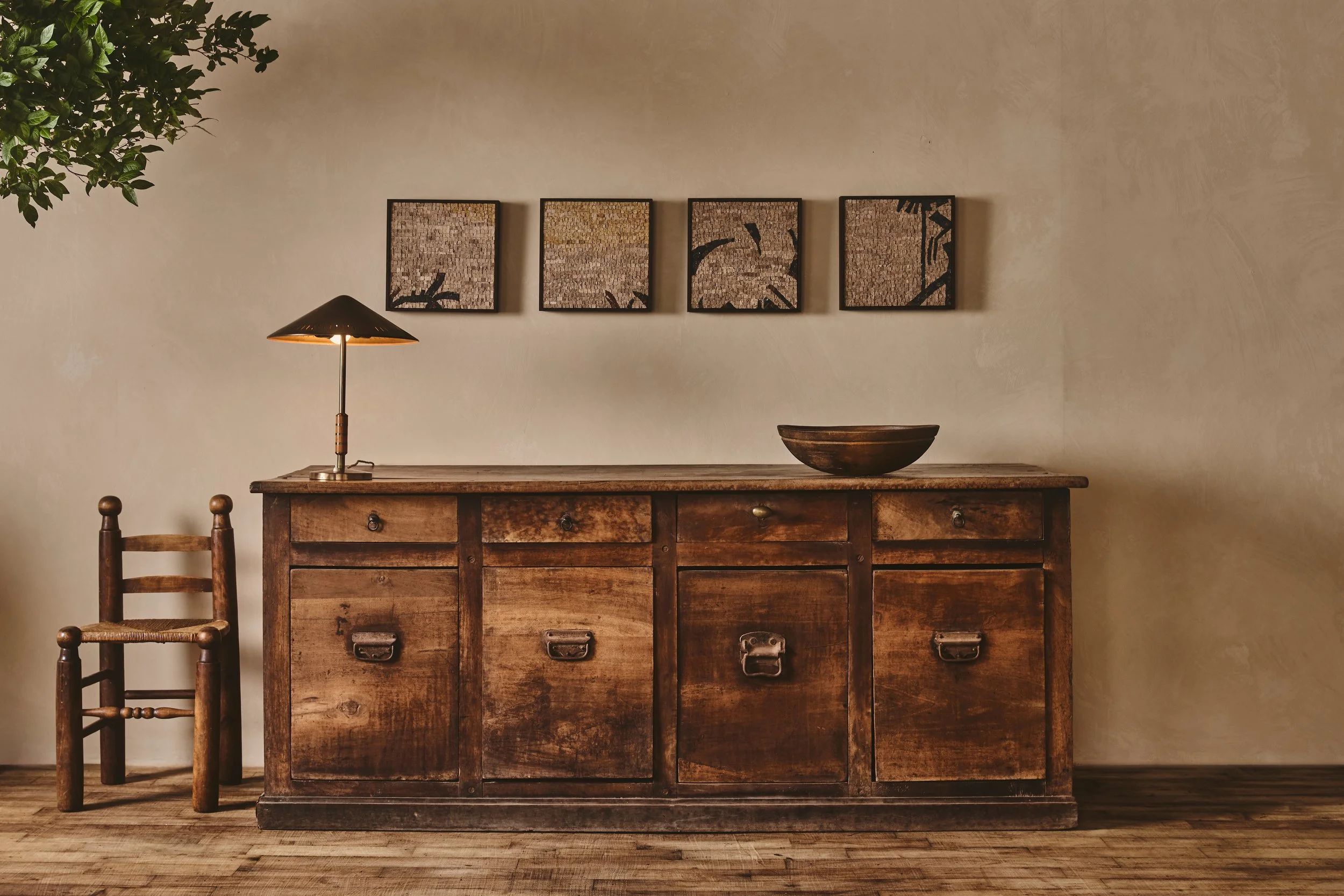
Love our custom stain and unlacquered brass hardware on our Bruges Credenza from Roweam - That Ogee profile on the wood top is Everything!
The Kitchen Lounge
We custom made our Bruges Credenza from our sister company Roweam. Layered with and Italian mid century brass floor lamp in the style of Arredoluce and two reupholstered Danish MCM chairs with a 1900s Malayer Rug and a custom limestone coffee table
- Shop The KITCHEN LOUNGE -
This 18th C. Burl Wooden Bowl, features a heavy patina and organic edges. Wear consistent with vintage product. Burl wood with 19th c. repair.
Elegant and romantic, this pair of Danish cabinetmaker chairs offer winged arms and a little leg; perfect for any sitting room. Internals reworked and reupholstered in 100% melange wool bouclé.
Abstract figure on wood pedestal, is from artist, OZwaig. This ceramic sculpture with rough resin finish shines in color and shaping. At first glance, one figure is seen, slightly rotate the sculpture and it would appear two figures are embraced. A subjective interpretation for a true collector.
Solid oak French coffee table. This masterfully minimal stained oak table features an angular X base and reverse knife edge top. A heavy patina makes this table a perfect piece in conversation with two lounge chairs or as a partner to a small settee.
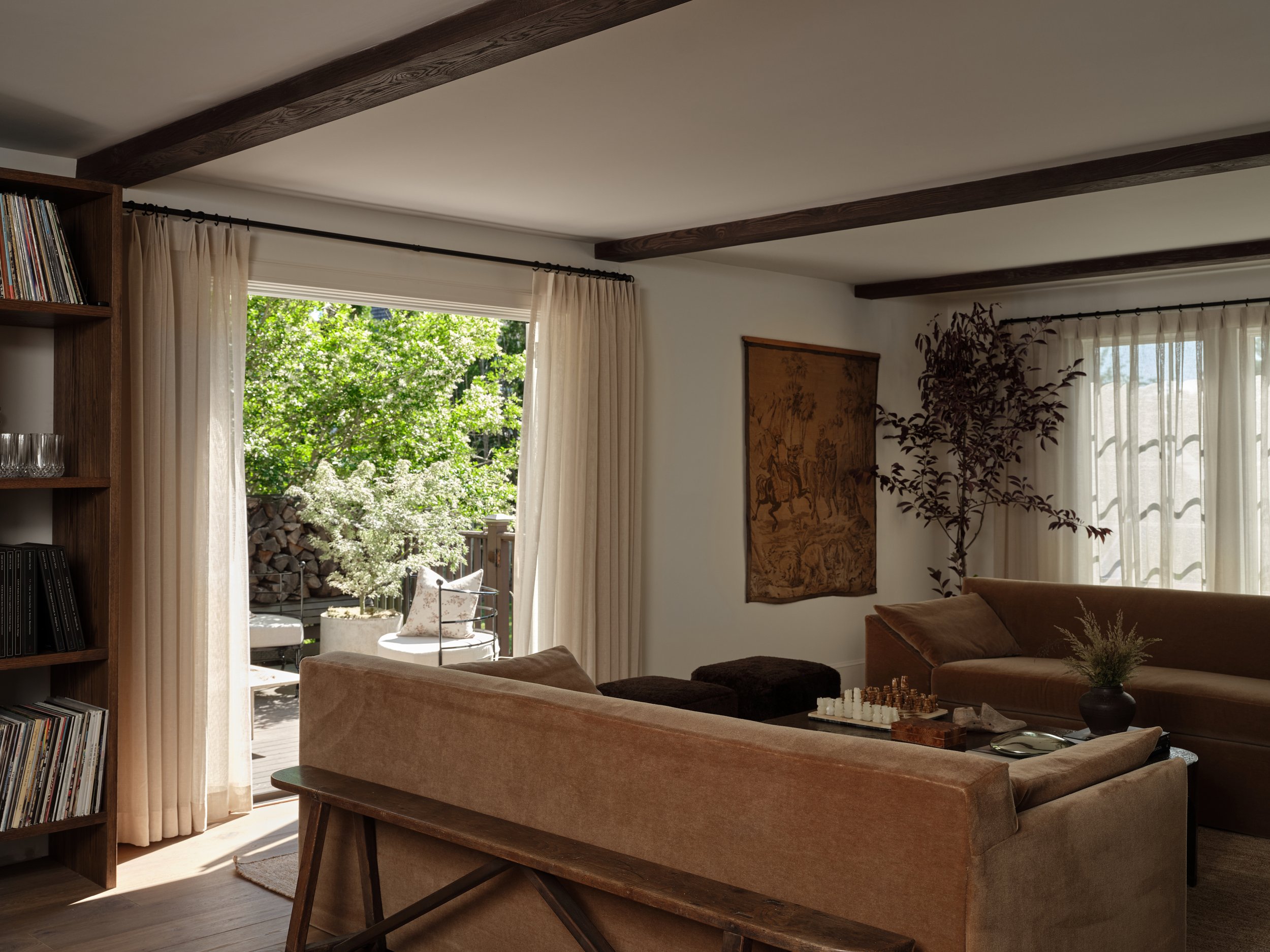
The Mohair on those custom Bromley sofas by Roweam is Everything!
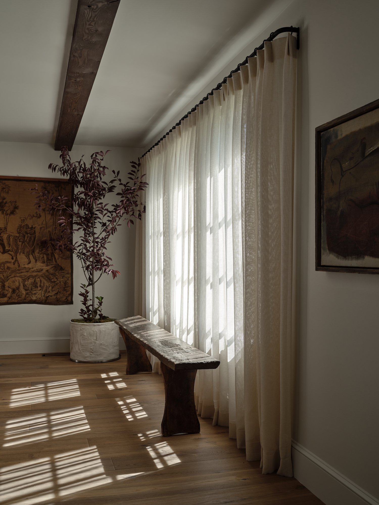
Oversized Windows fill this whole room layered with soft custom sheers.
The Living Room
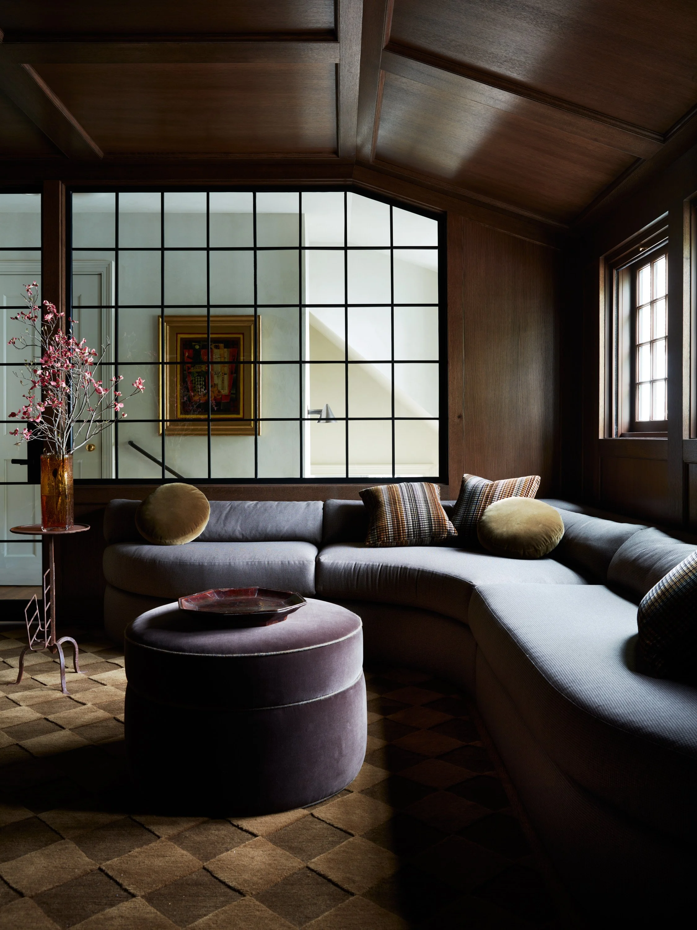
Leading from the back side of the house you pass the half bath and into the Living room area. We expanded the windows in this room as well as created a full fireplace and TV focal wall with a hearth constructed from BAS stone Emperador marble. And tadelakt walls. Adorn with our Roweam Bromley sofas in a burnt ocher mohair, hand woven rug from nepal, two of our mushroom stools from Roweam upholstered in chocolate shearling and a vintage found metal coffee table.
Tadelakt fireplace surround with a Emperador bronze marble as the hearth
- Shop The Living Room -
Handmade paper mache bowls, also known as Naga grain containers, in a variety of sizes. Minimal and versatile, these durable and light weight bowls have a wabi sabi aesthetic, popular in the region of India and cohesive in any interior.
Set of handmade dominoes c. 1800s. Packaged in wooden toy box with tongue and groove joinery. Perfect to show off on game night, or on display.
The Bromley Sofa is an amalgamation of eras and styles. Its angular arms are designed for lounging. Inspired by Italian mid-century design and draped in English-style slipcovers, it's both streamlined and stately.
Petite wooden bench is made with radiused ends. Delicate and aged, its patina is unmatched. Perfect for display.
The Disco Library Lounge
Our clients love to dance so we wanted to create this all encompassing disco library for them to kick of their shoes and dance. Enough space for a bar, books, records and all of the accessories.
Solid white oak with our custom Moore House Design stain This Disco Bar was created to hold a plethora of items for our clients.
A Huge record collection we also wanted to create space for the clients to be able to add more to their collection.
- Shop The DISCO LOUNGE -
Primavera woven floral pillow. Beige, red, blue, and green tones. Down feather blend insert included.
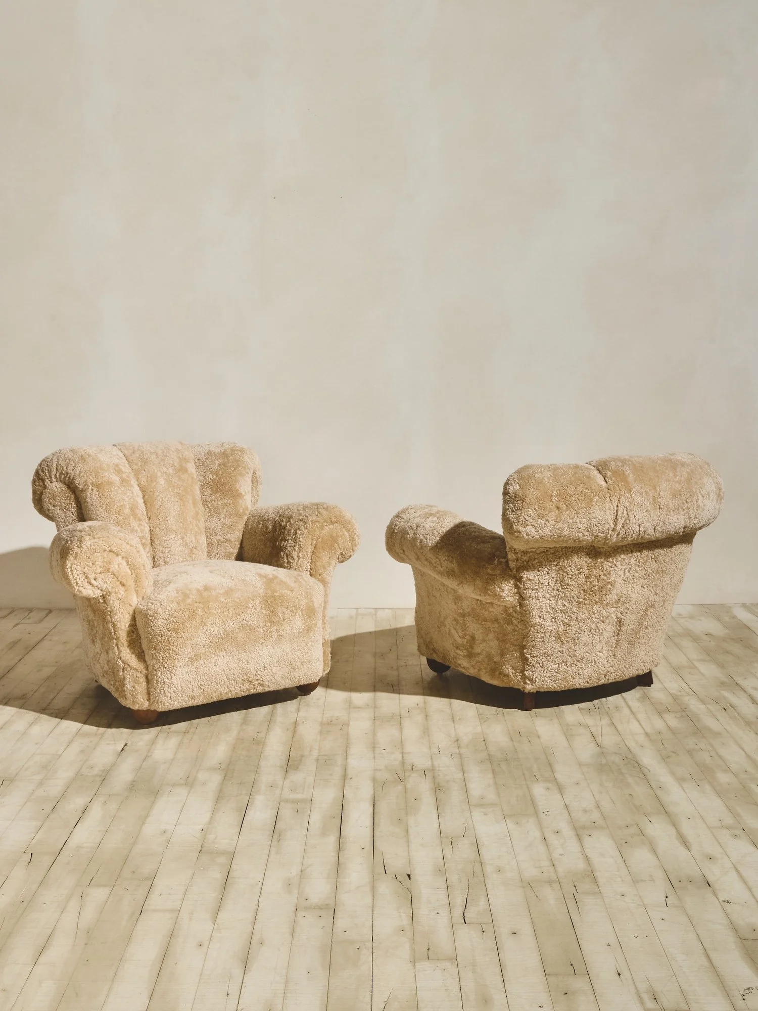
Full of character and curves, our Momma Bear Chairs came all the way from Denmark. Reupholstered in a soft shearling aimed to wrap you in comfort.
Articulated mannequin hand, once a tool for sketching and drafting, sits proudly patinaed on metal pedestal.
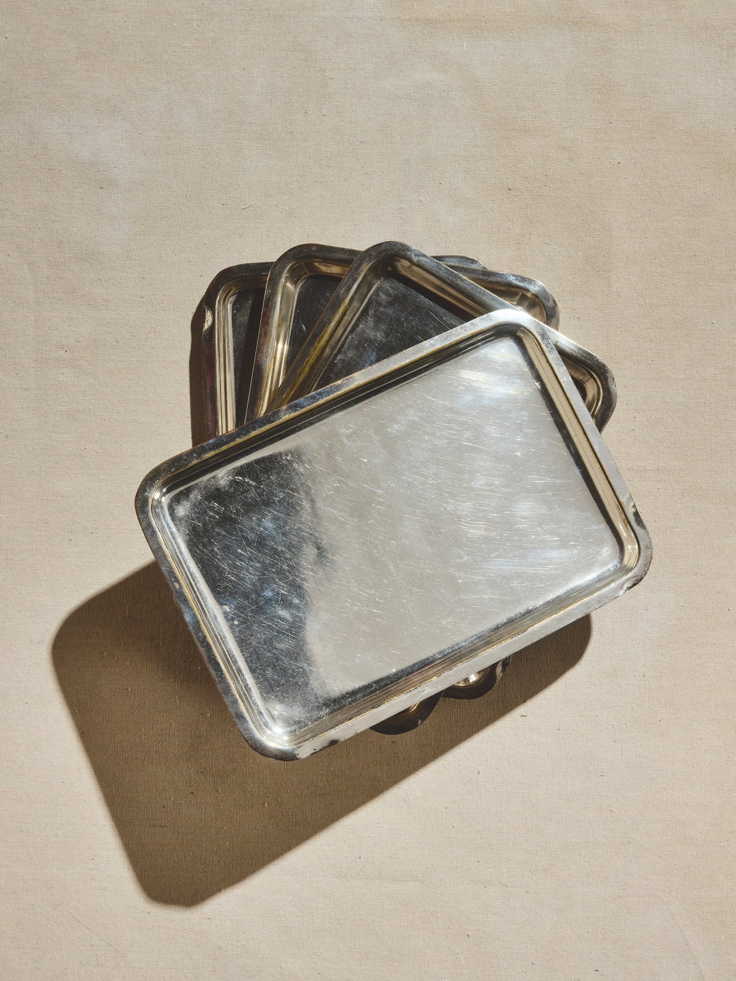
Rounded edged, heavily patinated silver tray. Perfect for collectible barware or as an entry catchall. Stamped from 1691.
Floating oak shelves and wrap around Fireplace Hearth
custom sourced vintage Mahal runners custom sized and bound together for a full staircase run
A Custom hand hammered Iron railing designed by Moore House Design
The Staircase
Upon the entry there was a double height opening to the second floor that did allow light but a very narrow walkway from the main bedroom to the little girls bedroom. We closed this up to gather a greater walkway space as well as a functioning small laundry area for our clients on the second floor. Changing the entire house of windows allowed us to really open up the front door package as well as create a lot more natural light within the house. Bringing in that quintessential Colonial aesthetic with thin ogee ⅝ muntin grills on the windows.
I wanted the staircase to be a focal point. Something that felt hand forged and crafted. I dreamt up this design whilst I was sleeping and woke up with my sketchbook in hand and sent it over to the team the next day. A mix of Vintage mahal runners cut down and stitched together created the never ending staircase runner.
- Shop The ENTRYWAY -
Small wooden square dishes. Simplified in shape and form. Can be used as salt and pepper cellars. Wear consistent with age and past use.
Tall stoneware vessel with applied handle in white finish. Patina consistent with age.
A black stoneware bowl produced by Swedish designer, Gunnar Nylund, circa 1930's. Nylund was a revolutionist in matte glazing techniques and his unique coloration. Signed Gweden AXK.
Bronze abstract sculpture on stained wood pedestal. Circa 1960, signed by artist "Marr." This decorative sculpture is well suited for bookshelves, buffets, and credenzas.
Half Bathroom
A custom Calacatta Viola Vanity makes our little jewel tone bathroom pop with custom mixed plaster walls by Master of Plaster and an mid century italian Vintage mirror.
- Shop The BATHROOM -
Vintage brass Italian arched mirror. Exquisite patina.
Venice canal bridge, oil on canvas. Matted. Textured wood frame. Signed by French Artist - the late P.P.Desrumaux.
Both simple and intricate, this Petaled Footed Silver Dish is the perfect toiletry dish for cotton swops, eye pads, or soap.
Reach out to hello@roweam.com for more details.
The Exterior
This was a quick little refresh with vintage Russel Woodward exterior settee and chairs newly upholstered with new cushions in a MHD staple fabric with a limestone coffee table.
Custom Ghent Side tables by Roweam launching this fall
Vintage Harvard Divinity School desk & a gallery wall of vintage coastal watercolors
Our first ever Bromley Bed & Pillows by Roweam
The Main Suite
We wanted to bring the moodiness up here for the clients to rest and relax and add a bit of juxtaposition to the bright first floor. The clients wanted an oversized large vintage Mahal rug to adorn the entire room. Layered with our first ever created Bromley Bed and two of our Roweam’s Ghent Side tables, two bedside table lamps and a vintage Harvard Divinity school desk.
- Shop The MAIN BEDROOM -
Sleek and sophisticated, our petite Ghent side table in solid white oak is a modular masterpiece. Stacked with storage, featuring soft-close inset drawers and push latch hardware, this minimal side table is fit for use as a bedside chest or end table.
This tessellated mid-century Checkered Bone Lamp features a custom, sheer linen shade with ribbing that draws the eye to the bold black and ivory bone base.
Originating from the Harvard Divinity School circa 1910, this salvaged antique oak writing desk has a privacy riser and slim shelves.
Day in the Village. Charcoal on paper. Signed. Stained wood frame.
Little Girls Room
This was a quick little refresh with Farrow & Ball Dead Salmon to adorn the walls. Layered with little vintage cabinets and bedding from Amber interiors Anthropology line.
We know you’re going to ask…..
Paint Colors
Well that about wraps up our full reveal of the BELGIAN Mid Century Project! Want to see some before and afters? You’ll have to check back in next Friday!
All Photography // Erin Little













Welcome to the Connecticut Captain’s Cottage Reveal Pt. 2