Disco Lounge designed by Moore House Design and photographed by Erin Little
Chances are, you've seen a glimpse of our Belgian Mid-Century Modern Project—be it on your Instagram, in House Beautiful, AD, or gracing the front page of Newport Life Magazine, yet the narrative of its transformation remains untold… until now!
At Moore House Design, we love a good opportunity to unveil the captivating journey from 'before' to 'after,' peeling back the layers of our craftsmanship. This project stands as a cherished design: a modern European gem nestled in Rhode Island along the coveted ocean-side avenues of Aquidneck Island. Like many of our New England-based projects, these homes often bear the remnants of builder-grade finishes and incomplete renovations, presenting our clients with a fragmented starting point. Our mission? To seamlessly stitch these fragments together, making each room feel like it had a real purpose and connection.
After // We transformed the double-height entry into a second-floor laundry room, a creative solution that met the client's needs, while added square footage to the home. A win-win! To enhance the entrance's grandeur, we pushed back the wall beside the staircase, opening up the space. The addition of floating oak shelves with marble wrapping around the fireplace hearth seamlessly connects each room and element, establishing a cohesive flow throughout the house.
After // Now we are talking! We enhanced the staircase with these custom-sourced vintage Mahal runners, meticulously re-sized and bound together for a seamless full run. We completed the space with a hand-hammered iron railing crafted by our team at Moore House Design.
— ENTRY & STAIRCASE —
Initially, we were faced with a narrow walkway and a towering double-height opening to the second floor. We took on this challenge by reconfiguring the space, expanding it to accommodate a practical small laundry area upstairs, not only adding square footage to the home, but leaving the staircase as a standalone focal point.
Brought to life with a hand-forged metal railing and layered with two vintage Mahal runners, and centered to reveal a peek of the wood flooring, the naturally beautiful Mahal rug, crafted in Isfahan, central Iran by different artisans and craftsmen, ensures that no two runners will ever be the same. Seeking seamless color continuity, we aimed for a 28-foot-long by 2-foot-8-inch-wide runner but encountered a challenge in sourcing one. This is where Blair and the MHD team truly shine!
We adeptly sourced two vintage Mahal runners in complementary hues, despite their differing widths. To achieve the seamless look we envisioned, showcasing a perfect 3-inch peek of wood flooring on either side, we collaborated closely with a trusted vendor. Together, we skillfully removed the wider border of one runner, trimmed it to size, and seamlessly reattached both the border and fibers, ensuring a flawless integration that remains imperceptible from the front of the rug. Each fiber meticulously woven back together by skilled rug artisans, these runners are carefully positioned on each side to seamlessly match in width, preserving the integrity of the intricate border detailing.
shhh… a little Moore House Design secret!
Before // Right off the entry, the dining room lacked cohesion with its cumbersome chairs, overly tall credenza, plain windows, strip flooring, and misplaced rug, leaving the space feeling incomplete.
After // Let’s take a moment for that huge record collection — So rock & roll!
— DISCO LOUNGE —
Our clients' love language is dancing to a vintage record. So, of course, this ignited the creation of our disco library lounge. We intended to design this space with versatility in mind, including a bar, books, records, and all accompanying accessories. The finishing touch to push the ambiance further were these 70’s lounge chairs from one of our favorite vendors, Somerset House. They add a touch of comfort and mid-century style to this multifunctional haven, and our clients love them!
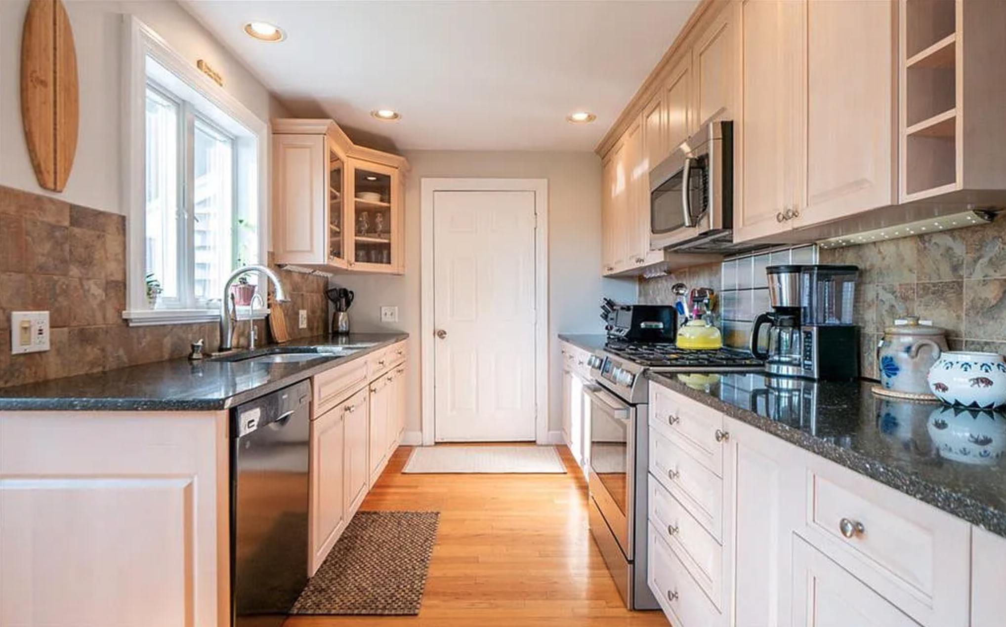
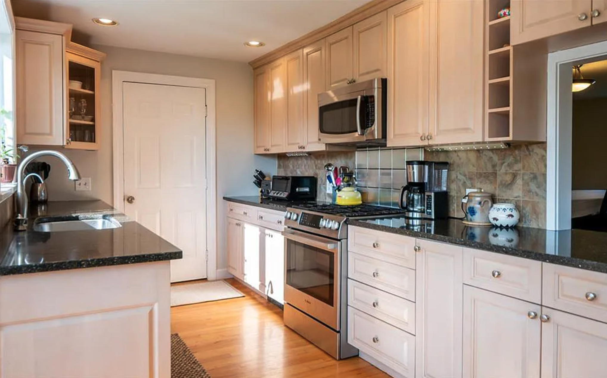
Before // The kitchen's builder grade outdated 80s cabinets were constricting, hindering cooking space and functionality. The wall separating this kitchen from what was the dining needed expansion to create a more inclusive cooking experience.
After // First, we upgraded all the windows in the house with Marvin's architectural collection, featuring a ⅝” ogee profile muntin and elongated design, significantly modernizing the space and infusing it with a timeless colonial charm, a remarkable departure from its 80s origins.
— THE KITCHEN —
As you know, with a growing family, this means spending a lot of time in the kitchen. Our client really wanted a space where cooking and creating memories went hand in hand. Drawing inspiration from Pierre Jeanneret's iconic pigeonhole desk, we envisioned this as the muse for the island. Our goal was to merge the essence of the home with the client's aesthetic preferences. The result was to artfully blend the dutch colonial architecture of the home with the clients midcentury influences throughout the space. Mid-century when layered all together can feel quite stark and not exude any feeling of comfort. This is where the Belgian inspiration was drawn from; We wanted to layer the comfort of a soft Belgian farmhouse feeling focusing more on material than silhouette. Think soft bouclés, textured plaster, inviting warm wood, cozy sheepskins, luxurious mohairs, and crisp linens!
Before // The awkward cut-out 'window' in the interior wall to the right of the stove adds to the cramped and dated diner-like atmosphere of the space. *Orders up*
After // The kitchen exudes sophistication with the addition of four custom ROWEAM Wolcott Stools, a bespoke 10-foot island designed by Moore House Design in the style of Pierre Jeanneret's iconic Pigeonhole Desk from the 1950s, and integrated double dishwashers flanking the sink, all while ensuring durability for a family-friendly environment.
After // My favorite spot in the house, this integrated custom cabinet boasts walnut interior drawers and a hand-poured concrete countertop, showcasing exquisite details while offering a glimpse into the adjoining lounge from the kitchen, creating a cozy ambiance that I adore.
Custom cabinets that we designed with integrated cabinet pulls from one of our favorite vendors. We used our tried and true Tadelakt technique to plaster the walls and hood, hand-poured the concrete counters and painted the cabinets with enduring bronze from Sherwin Williams. All of the cabinets are integrated with drawer organizers, knife blocks, pot holders, plate racks, spice racks. Everything our client could use for the perfect working kitchen! We also added some custom-made Wolcott Stools and our Black Cumin pots from ROWEAM.
Behind the seating area for family and friends at the kitchen island we integrated a wall of built-in cabinetry to be the same color as the plaster walls. This hides the pantry, coffee bar, and fridge freezer.
Working with our craftsman we worked to create full panel integrated cabinet pulls. After multiple rounds of samples and trial and error it was executed to perfection. The goal was when all of the cabinets were closed it would feel like a fully seamless wall that you would walk past to head to the breakfast nook.
Our client desired a dedicated coffee nook, prompting us to ingeniously embed it within this concealed oasis, seamlessly blending functionality with hidden charm.
Our focus was on optimizing the kitchen's space efficiency. We achieved this through seamlessly integrating the hidden pantry to maintain balance and functionality, while elevating the home's overall aesthetic appeal.
Before // This space fell flat… with the mismatched colors and furniture that varied in seat depth, our aimed was to craft a seating area that perfectly suited our clients' lifestyle.
After // We adorned the space with an Italian mid-century brass floor lamp reminiscent of Arredoluce, featuring an original plaid shade, which became one of my favorite elements in the entire project. We firmly believe that one exceptional lighting piece can uplift an entire room. Additionally, our custom stain and unlacquered brass hardware on the Bruges Credenza from ROWEAM (launching this fall) stole the show - that Ogee profile on the wood top is simply exquisite!
-KITCHEN LOUNGE-
New Additions: We introduced a window on the left side, adorned with floor-to-ceiling sheers, infusing the kitchen with a gentle touch of softness.
Given the characteristic low ceilings of colonial New England architecture, standing at 8'8, we recognized the necessity of embellishing the ceilings with additional detailing. Here's a valuable MHD tip: never overlook low ceilings. Detail and texture can be your greatest allies. To add visual interest without sacrificing height, we incorporated lower wide-profile beams throughout the entire first floor.
To complete the ambiance, we selected two vintage MHD chairs, a favorite find, vintage burl bowl from ROWEAM, and paired them with a travertine coffee table. Layered atop is a vintage Mahal rug, complemented by one of our cherished discoveries: a vintage burl bowl from ROWEAM.
Before // Although the concept of making a bay window seat by adding an island may appear innovative, it lacked cohesion, limited functionality to space constraints and the overall aesthetic did not match the rest of the home.
After // When designing the banquette, we use a stepping stone concept, adding multiple height levels within a room to add depth, visual interest, and a dynamic flow to the space. This technique not only enhances the aesthetic appeal but also creates a sense of dimension and intrigue, making the room more engaging and inviting. Complementing this design ethos, we've curated a blend of leather and velvet upholstery, ensuring durability for families with kids while maintaining the integrity of the inviting warm textures that define the space.
-THE BANQUETTE-
Previously, this banquette fell short in durability for our clients growing family and failed to serve as a central gathering spot for guests. We were eager to transform it into a resilient and inviting space, so we transformed! We brought in a custom River table by ROWEAM , a banquette designed by our team with leather from Moore and Giles, topped with a velvet upper from Alt for Living. We aimed to expand the banquette area to accommodate more family lounging, addressing both its original height, which was too high, and its shape, which didn't align with the bay window's curvature, limiting seating capacity. Additionally, transitioning the seating to dining table height added further versatility and cohesion to the space. The result seamlessly melds comfort and style with durability, catering to the needs of children during meals. To elevate the space, we incorporated the Knitterling Pendant by Ingo Maurer from Rewire LA, complemented by newly upholstered Vico Magistretti Carimate Chairs. With these additions, the banquette is now an ideal setting for hosting memorable gatherings or savoring that first sip of coffee!
Additionally, this custom River Table from ROWEAM, adds more space back into the kitchen, serving as a practical and stylish solution for optimizing the area's functionality and visibility.
Before // As much as we love a good vintage fireplace, our clients really wanted a cohesive style to flow seamlessly throughout their home.
After // Here's a closer look at the marble shelf seamlessly extending from the entryway into the living room. Additionally, the Tadelakt fireplace surround, complemented by an Emperador bronze marble hearth, exudes luxury, while the intricate scalloped fireplace divider — it's pure perfection!
-LIVING ROOM-
When we began this project, the flow and functionality were obstructed by a monstrous hearth beneath the pellet fireplace. Transitioning to a gas fireplace presented an opportunity for change, which the clients eagerly embraced. The living room felt cramped, there was not much room to have family night, whether that was to watch tv, play games, or host a gathering. So, we started by expanding windows and adding a full fireplace with Emperador marble by BAS stone and tadelakt walls to make this space cozy and user friendly. We anchored the TV and fireplace wall with two of our signature Bromley Sofas by ROWEAM, complemented by a Nepal-woven rug, two Moore and Giles chocolate shearling-upholstered mushroom stools, and a vintage metal coffee table discovered at Brimfield, culminating in a perfectly balanced space.
Before // The living room lacked depth, with the stone fireplace and light floors creating a stark contrast, while the blue undertone of the white walls failed to infuse vibrancy into the space.
After // The soft sheer linen curtains gently filtering the sunlight, delicately caressing the Mohair upholstery on those custom Bromley Sofas by ROWEAM, create an ambiance that embodied warmth and comfort.
We expanded the backside of the room, installing floor-to-ceiling windows to invite natural light into the home and offer the clients a breathtaking view of their stunning backyard ( see images at the end of the blog post)
Before // Every aspect of this half bathroom felt incomplete and uninviting, from the tiles to the corner sink to the harsh Florissant lighting overhead—because who really wants to see themselves under such harsh glare?
After // Broody elegance is our specialty!
The custom Calacatta Viola Vanity steals the show in our jewel-toned bathroom, accentuated by the bespoke mixed plaster walls crafted by Master of Plaster & Flavio Bragaloni and a stunning mid-century Italian vintage mirror.
-HALF BATH-
At the project's inception, this petite half bath lacked the wow factor. Situated adjacent to the downstairs kitchen, our goal was to elevate its appeal for both family and guest use, while also reconfiguring the entry point to provide better privacy and separation from the kitchen area. Our journey began with the addition of a custom Calacatta Viola Vanity, complemented by bespoke plum burgundy mixed plaster walls by Master of Plaster and our favorite artisan, Flavio. The pièce de résistance? A brass Italian vintage mirror. What was once a mundane space now exudes a captivating allure, delighting guests with its unexpected charm!
Before // The main bedroom was lacking charm, but with a fresh coat of paint, new furnishings, hardwood floors, and elegant curtains, we were able to effortlessly transform this outdated space into a welcoming retreat.
After // Set to launch in fall on ROWEAM in 2024 is our Bromley Bed, Ghent Side tables, and Vintage Harvard Divinity School desk. We styled these pieces with a gallery wall adorned with vintage coastal watercolors, completes the space adding a level of sophistication to our clients bedroom.
— MAIN BEDROOM —
Previously, the upper level lacked the charm and atmosphere our clients craved. Our goal was to fashion an oasis, a sanctuary where clients could retreat and decompress after a taxing day. With curating the infusing the space with a mood of subdued sophistication. Anchoring the room with an oversized vintage Mahal rug, complemented by our Bromley Bed (Launching in 2024), and accented with Roweam Ghent Side tables and table bedside lights. A vintage Harvard Divinity school desk, adds character and history, while a sheepskin Chair beckons for moments of quiet contemplation. Together, these elements cocoon our clients in a tranquil haven, with the ceiling softly casting dappled light that evokes the sensation of gazing into a starlit night sky.
Overall this room was a quick refresh with new furnishings, flooring, and a great lick of paint did the trick. Just dreamy!
The Belgian Mid-Century Modern project scope was a Full Scale Design, Renovation, Refresh & Furnishings Project—Interior & Exterior Two floors: Living Room, Dining Room, Disco Library lounge, Kitchen, Banquette, Kitchen Living, Half bath, Main Bedroom, Daughters room, Staircase.
WE’RE TAKING NEW CLIENTS! SHARE YOUR PROJECT SCOPE WITH US HERE.
- Project & Renovation Scope -
Complete Renovation & Furnishings Project by Moore House Design
Furnishings & Custom items sourced from ROWEAM
Photography by Photography: Erin Little Photography
Location Project Location: Portsmouth RI
Get Moore House directly in your inbox
To end this project — This outdoor oasis attached to the living room was a quick little refresh with vintage Russel Woodward exterior settee and chairs newly upholstered with new cushions in a Moore House Design staple fabric with a limestone coffee table.


The Roweam Earthenware Collection is rooted in reverence for the natural world—a grounded celebration of texture, form, and sustainability. This curated offering honors the quiet strength of the earth, featuring hand-hewn woods, sun-warmed ceramics, and raw, time-worn materials that echo ancient landscapes. Designed to elevate interiors while paying tribute to the places that inspire them.