Before & After: English Modernist
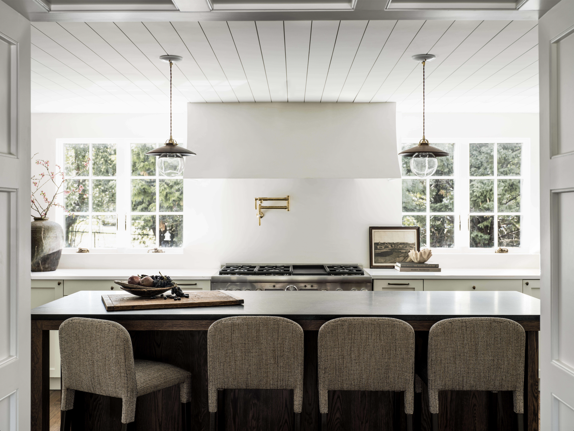
You guys, this might be our most dramatic before and after to date. If you haven’t seen our English Modernist reveal yet, then allow us to introduce you to this understated beauty. Filled with soothing colors and sumptuous fabrics and textures, you won’t believe your eyes when you see where this project started. It’s a complete 180-degree shift. Without further ado, prepare to have your mind blown with the pictures that follow. All we have to say is blue vinyl countertops.
Before: Outdated and mismatched appliances reflect the hodge-podge of renovations.
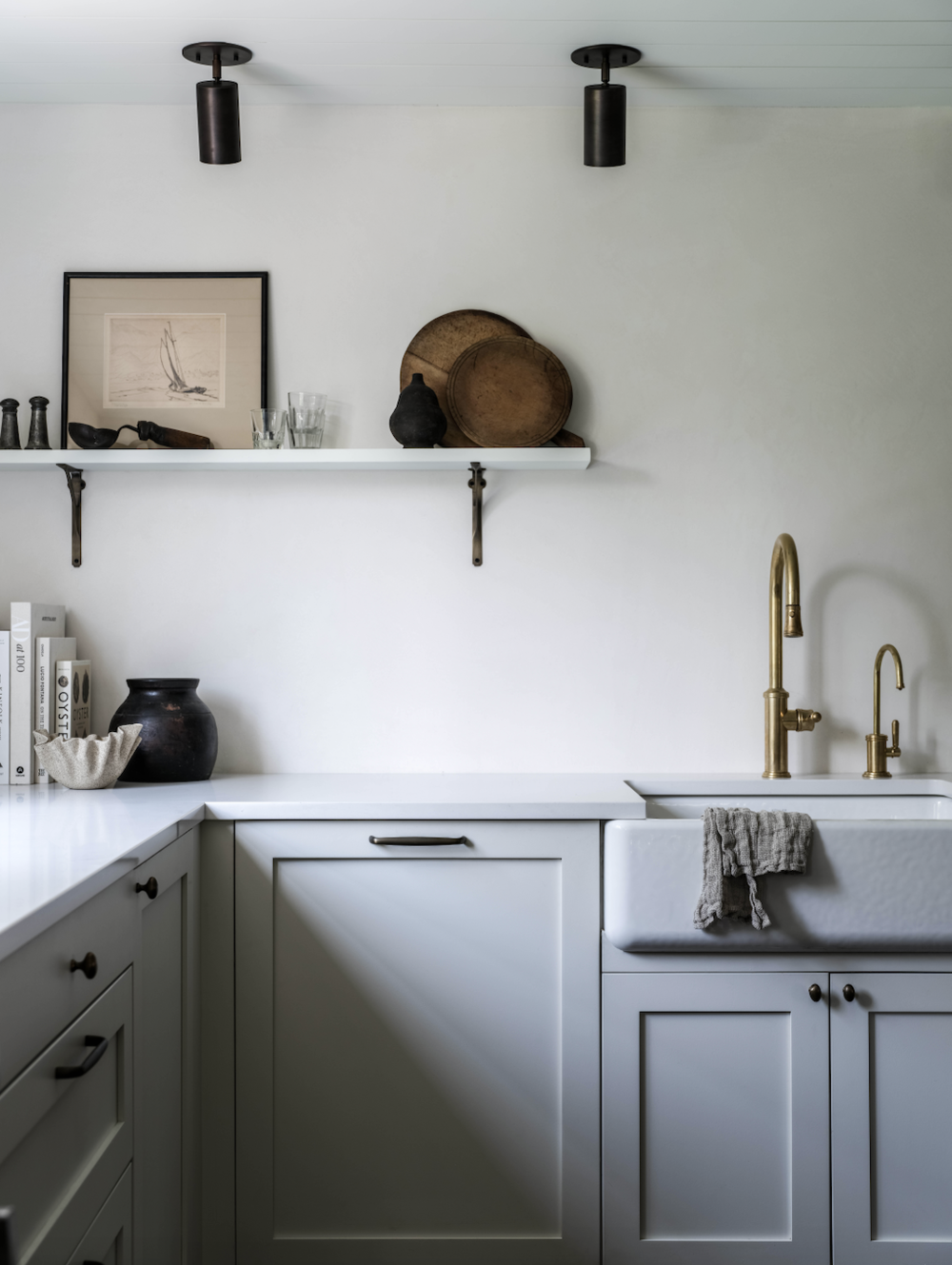
After: Streamlined cabinetry and some open wall space calm down this section.
What We Started With…
Our wonderful clients started in a place where many homeowners find themselves—dealing with design decisions from decades past. It can be a really overwhelming process to know that you want and need to make updates, but that’s where we come in to streamline the process. The first priority was the kitchen since the couple like to cook and bake respectively and we had a lot to do in order to incorporate smarter storage, more functionality, and flow to this mismatched room. As you can see the kitchen had elements of 80's veneer paneled cabinets, vinyl countertops, and had zero detailing or trimwork. The room was also seriously lacking in natural light and was boxed into a small separate room that felt removed from the rest of the home. We knew we had some work to do!
Before: Walls box in the kitchen separating it from the living room.
After: The foundation hasn’t changed, but design changes make these rooms feel open.
After
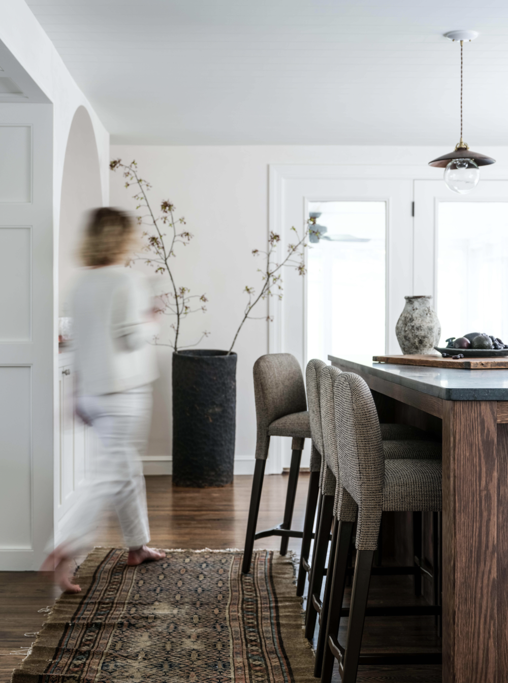
Outside of the decor updates we had two major priorities in this room—we knew we wanted to remove some walls to incorporate the kitchen into the family/living space, helping the kitchen to feel more connected to the rest of the house. There’s a charming little garden in the back that we wanted more access to, so we added larger windows to really help bring some of that inside. Also, we wanted to add some architectural details while being cognizant of the fact that we were dealing with lower ceilings. The solution? Adding some English-style, nickel-gap paneling to the ceiling. The lines move your eye through the room, while adding interest and texture.
Before: Dark and cramped.
After: Bright and airy!
Another thing that we have to mention—sort of the star of the space—are these Wolcott stools. If you look, their texture, colors, and shape all help inform the rest of the design throughout the room. Plus, they complement the island which is made of the most beautiful soaked stained oak. Swapping in pendants for recessed lighting also lends a touch of glamour to the room, lighting fixtures and hardware are always like jewelry for the space.
We can’t forget about some of the beautiful built-in storage spaces we added either. It helps keep clutter at bay and makes the whole room look so much more streamlined and organized. Everything has its place to get tucked away until it’s needed. We added an arched plaster cabinet that we installed for the dry bar. Perfect for storage and entertaining. We also created a little coffee bar with semi handmade doors and a retractable hinge, meaning it can be left open or closed. Who doesn’t want coffee at their fingertips?!
Before: Missing out on an opportunity for organization with a too-large cabinet.
After: A simple desk keeps things like mail organized and off the counters.
We can’t say enough good things about creating an entrance, or more importantly an entrance space. Not only doesn’t set the tone for the rest of the house, it allows you to stay organized and keep things like shoes and jackets from cluttering up precious kitchen space. Here, we did a modified take on built-in cabinets that offered plenty of storage through both cabinets, hooks, and open-style shelving. The rich paint color we chose adds a really beautiful grounding element to the light and airy kitchen.
Before: A entrance area that has to do a little bit of everything.
After: Built-in organization helps streamline this busy space.
After Images: Erin Little Photography


The Roweam Earthenware Collection is rooted in reverence for the natural world—a grounded celebration of texture, form, and sustainability. This curated offering honors the quiet strength of the earth, featuring hand-hewn woods, sun-warmed ceramics, and raw, time-worn materials that echo ancient landscapes. Designed to elevate interiors while paying tribute to the places that inspire them.