Living Room designed by Moore House Design and photographed by Jared Kuzia
We introduced our Minimalist Club Project back in November, but we never really shared the journey with you. Before and after transformations are one of our favorite things here at MHD as they allow us to demystify the magic behind our work. Our clients approached us seeking guidance on achieving an aesthetic balance through hyper minimalism, clean surfaces, and visual simplicity. The interiors of this condo had been last updated in late 90s with inexpensive materials that lacked luster & craftsmanship. Our scope involved a Full-Scale Design, Renovation, and furnishing, with ROWEAM heavily involved in the process.
— THE KITCHEN —
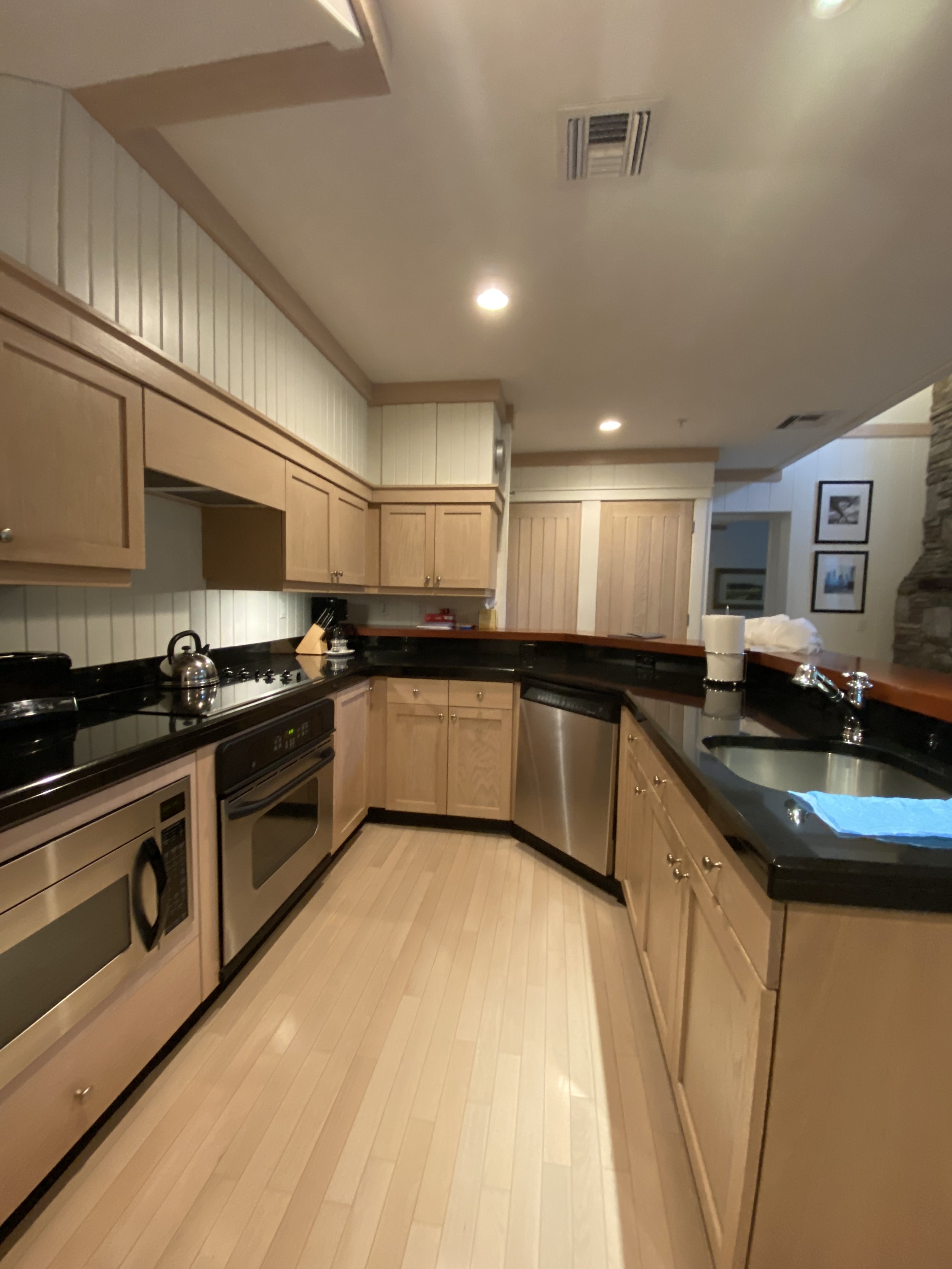
Here is the kitchen and Island before, very outdated, constricting and lacking flow. The existing trim and original cabinets made the fridge stand out and the flow in and out of the kitchen incredible constricting. Our vision for the Minimalist Club project was to connect with the surfaces that evoke a sense of respite. In a world filled with so much conversation and visual and virtual noise, the word "respite" really became our north star.
The design ecompases hard and soft materials where we could play with the idea function.For example we had amazing makers like SFM and Livingstone Concrete that worked with us to carefully craft the Island to fall seamlessly into the floor line.
After // Although modern, the craftsmanship within this project was meticulous. From woodwork to stonework, plaster, concrete to glass fabrication, all the materials used in this project were locally sourced and hand-poured by skilled craftsmen.
After // Sakonnet Woodworking custom-made our cabinetry with Livingstonstone Concrete, which casts the curved island counters and backsplash. Urban bronzed finished Plumbing and a few of my favorite items featured from ROWEAM.
— DINING ROOM —
In the "Before" photos of the dining area, you can see that the space has potential, but the furnishings didn’t match our client's aesthetic. There is so much great lighting, a lick of paint and new furnishings can do to a space.
We wanted to keep the existing panel walls and installed new hardwood floors throughout the area, along with a custom flat weave rug. I love to have something in my interiors that pushes the boundaries, as it makes conversation and uniqueness when viewing the space. The ceramic meandering semi-flush mounts for the ceiling lights trail off to the left to connect the living room and dining room without being too contrived in one location, like a central floating saucer. I love the clients for trusting us on this idea and it’s now one of their favorite elements. Reference the first image in this article to see how they connect with the floating pendants in the living room.
Before // Very cumbersome dining chairs and a overly tall credenza. Wall to wall carpet also did not ground the dining room and left it feeling floating.
After // We custom-made our "Rhody Table" by Roweam in the dining room, launching in 2024. It was designed to fit the space and is paired with our ROWEAM Javor Pivka chairs upholstered in tumbled leather and a masculine blend of wool Houndstooth. The Lady Reading Oil on Canvas artwork creates a sense of calm yet still feels slightly off-kilter.
— LIVING ROOM —
The clients had difficulty furnishing their room due to the unique shape and curve of the kitchen island. They wanted to ensure that the room felt cohesive and flowed well with the rest of the area. Our objective was to balance minimal lighting with vintage details. To achieve this, we created a double vaulted living room that feels airy and enclosed. We utilized suspended pendants with glass globes that appear to float in space. The pendants are suspended by a small disc, which illuminates the globe and creates an impressive glow. We placed the pendants just above the vertical V-groove paneling to allow them to feel like the dining room ceiling height had continuity.
After // Can you say gorgeous?
Before // Multiple mismatches colors, textures making it very busy and not relaxing. Most of the furniture was either too narrow in seat depth or way too wide. We wanted to create the perfect seat depth that matched our clients lifestyle.
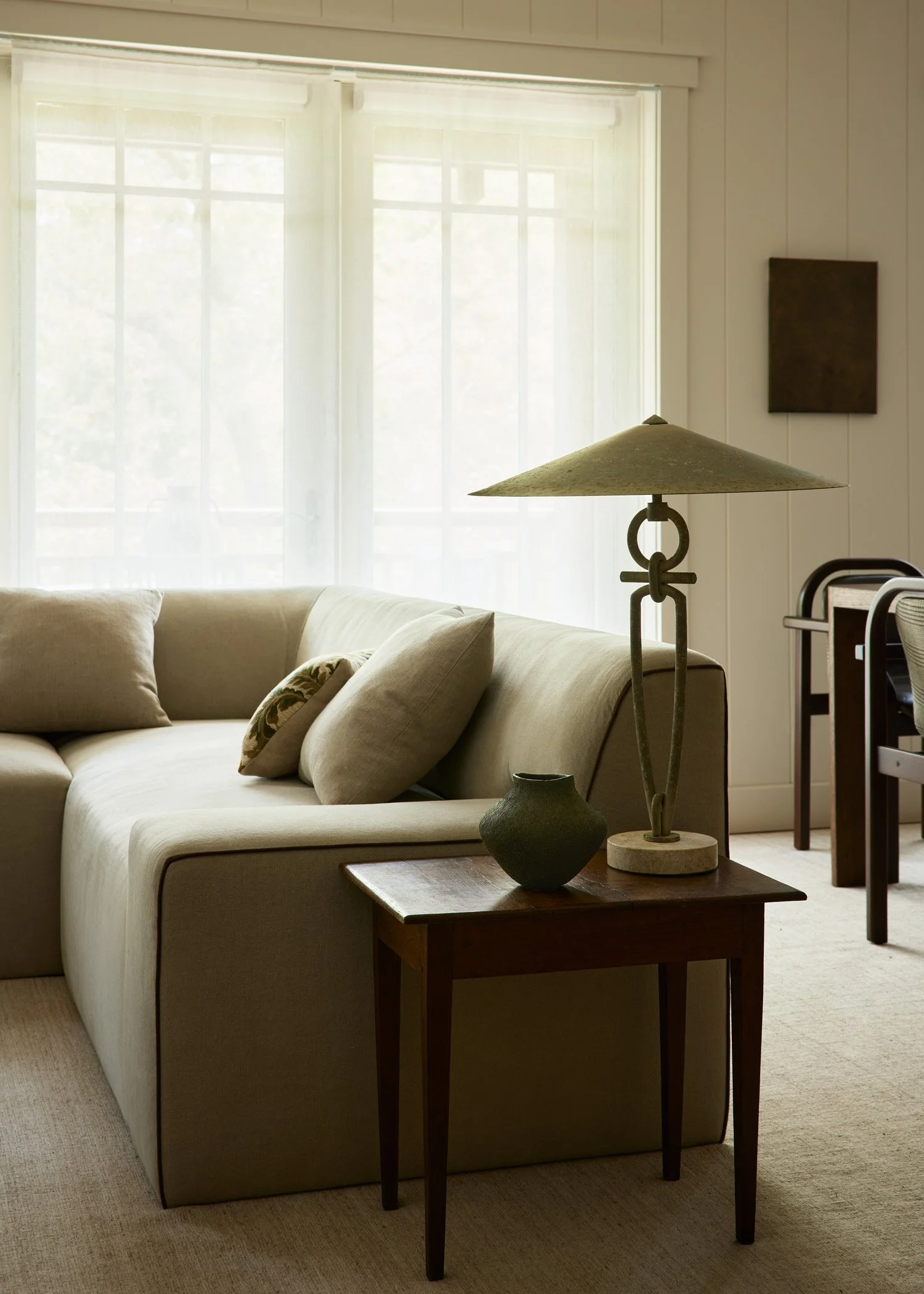
After // Our ROWEAM Buff sofa was designed with modern apartment living in mind. It has a clean and contemporary shape, but we collaborated with our namesake firm, ROWEAM, to ensure it is also incredibly comfortable (we plan to launch it next year). The sofa is layered with down and feathers but woven in a way so the filling does not settle or require fluffing.
After // We sourced a flat weave rug from Minor Casa to unify the living and dining rooms. The rug is simple yet elegant, and it helps to connect the two spaces. We added a few accessories from ROWEAM including our Lemon Oil painting, Sculpture & Travertine Lamp of our dreams to complete the look.
— THE LIBRARY OFFICE —
Our aim for this space was to design a cozy area for our clients to work from home, with a warm and inviting atmosphere similar to a library. However, we had to achieve this without spending a fortune on expensive mahogany paneling. Since this was a second home for our clients, we needed to find a cost-effective strategy. After researching, we found these beautiful mahogany room dividers from one of our vintage vendors. They became the focal point of the room, and we complemented them with a mid-century Hans Olsen settee and chairs, a French 1930s coffee table, and a hand-woven rug from Nepal. The combination of these elements created the perfect ambiance we were aiming for.
Before // Inconsistent sizes of furniture made the space feel disjointed.
After // Ahh.. thats better. Featuring a table from Roweam
— OFFICE BATHROOM —
There is a smaller bathroom located on the main floor that served the entire living space on the first floor. I came across these vintage marble stone tiles from Paris that have a beautiful veining and I knew they were perfect for the space. The tiles are slightly ballooned in the center, which creates a subtle movement towards the grout lines. Perfectly imperfect which is always something I gravitate towards.
The color is a perfect grey green color called Homestead Brown by Sherwin Williams
Before // Outdated, classic hotel bathroom with no warmth.
After // Broody is our specialty when she’s layered with our Jenna Vessel from Roweam
— MAIN BEDROOM —
The client wanted their bedroom to be a relaxing place to come home to after a long day of golf and entertaining. Our main focus was to create a calm yet textural escape. We designed a custom King-size bed with a more minimal headboard to let the ceiling draw the attention up. Layered with patinated vintage sconces and a vintage wooden French bench with radius ends that has the most beautiful, rich, and subtle patina, our custom New Vintage Ghent Side Tables from ROWEAM in natural stain and layered with my favorite Swedish vessels of all time, anything Gunnar Nylund.
Before // Mismatched furnishings and lacking craftsmanship and quality.
After // Our Roweam Ghent Side tables - in custom Vintage Rustic white oak, Vintage French Benches and some good old vintage Mahal Rugs
After // The little desk nook wanted to be airy and simple with a metal and leather-topped desk and our Javor Pivka chair.
— MAIN BATHROOM —
The original main bathrooms had been fitted with drop ceilings and builder-grade trim and tiles that did not meet our client's expectations. Our team collaborated with local artisans to craft a modern aesthetic while incorporating antique finishes, vintage materials, and high-quality products. We sourced plumbing fixtures from Australia, our motherland, and commissioned a local craftsman to custom-make the vanities. Additionally, we engaged local concrete artisans to create custom sinks, resulting in a modern take on a Moore House Designed bathroom.
Before // Love the boob sinks - hahahah
After // Vintage floor tiles mixed with new 36” square modern wall tiles to create as minimal a grout line as possible.
— GUEST BEDROOM —
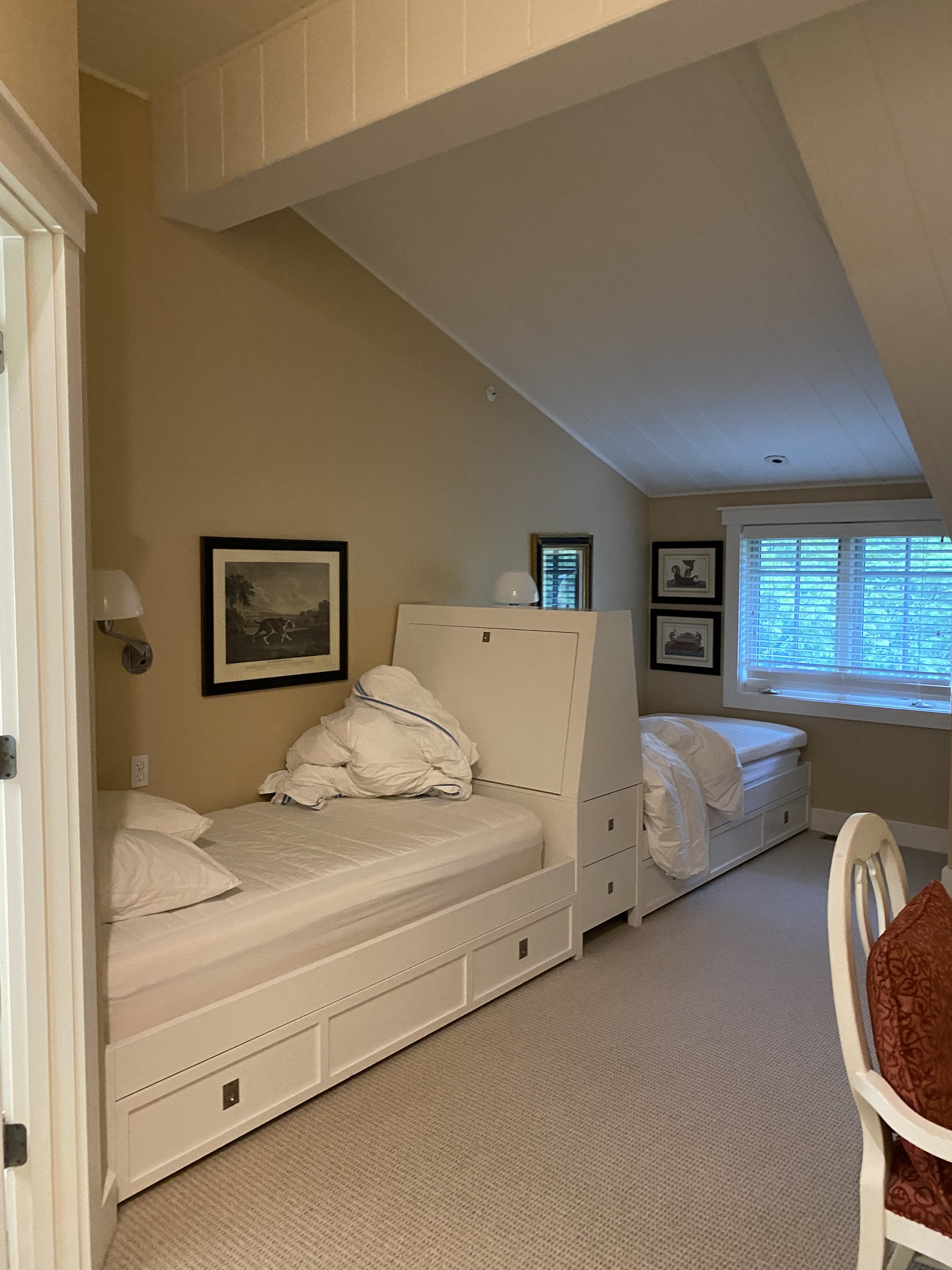
The clients at the club often have friends over to stay the night, so they needed to create a separate sleeping arrangements in a small room. I prefer some privacy even when sharing a room, so we divided the space into two using a v-groove-divider in the center. To create a cozy reading nook, we added some charming sconces with ceramic pull chains.
Before // The ceiling actually felt shorter here than when we added the divider wall with the V groove paneling.
After // Added more texture and warmth with our Side Table, Vessels, Art, and custom Bromley Bed sourced by ROWEAM
Before // A Lick of paint and new furnishings helped solve this outdated space for us.
After // Warmth, texture and quality. Layered with one of our charcoal original art pieces favorite pieces from ROWEAM
The Minimalist Club project scope was a Full Renovation & Furnishings Project—Interiors only, two floors: living Room, dining room, kitchen, office, office bathroom, main Bedroom, main bathroom, guest bedroom and guest bathroom. If you are interested in purchasing any of the featured ROWEAM items, you can find more specific information on the Minimalist Club Reveal page.
WE’RE TAKING NEW CLIENTS IN 2024! SHARE YOUR PROJECT SCOPE WITH US AT THE LINK BELOW.
- Project & Renovation Scope -
Complete Renovation & Furnishings Project by Moore House Design
Furnishings & Custom items sourced from ROWEAM
Photography by JARED KUZIA, Styling by Hudson Moore
Location Aquidneck Club, Florals by The Floral Reserve


Moore House Design Project REVEAL DAY!!! Introducing our Modernist Project! Wheew! Featuring some of our favorite Roweam vintage pieces, this was a full-service design, renovation, and furnishings project at the covetable Jamestown, Rhode Island Cove.