Before & After: Quonset Hut
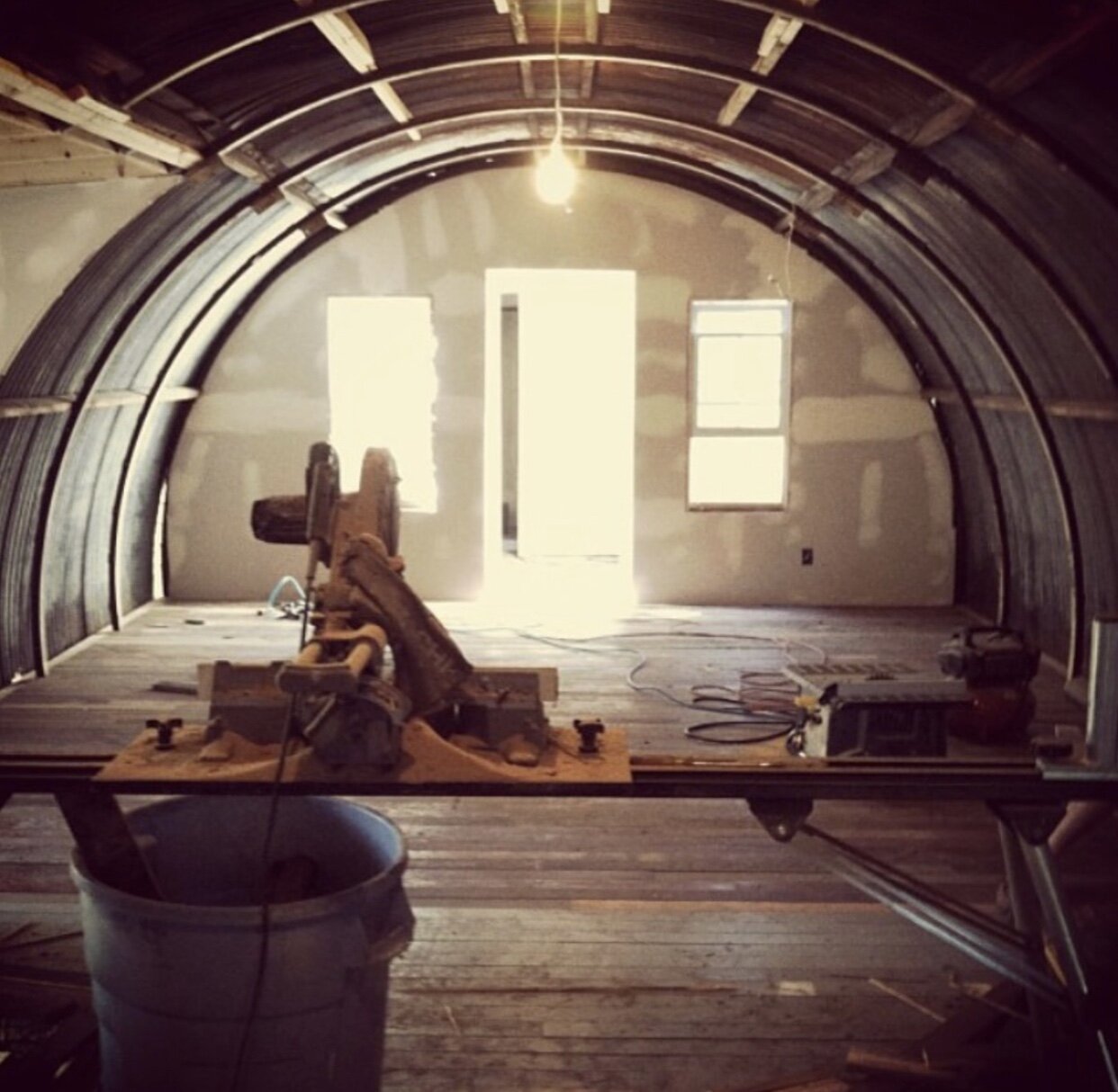
We’ve got this thing for old homes—the more challenging the better. That’s how our guest stay business really got started. We found historically significant properties around Rhode Island that were in disrepair and wanted to fix them up. That’s exactly what we did with The Quonset Hut that’s located in Tiverton, RI. An old 1940’s ammunition shell, the property had become overgrown and dilapidated over the years. Here’s a behind the scenes look at how it got transformed into our largest guest stay property:
Before- The staircase in the living room.
Before: The main floor bathroom.
Before- The staircase in living room during reno.
BEFORE: We believe that the property was owned by the sheriff’s son back in the day. The physical structure was two separate buildings that had become incredibly overgrown. The first property featured a narrow hallway and a bathroom and had dirt floors. The second residence was also very primitive, but we loved the interesting shape and the historical details of the property. Not many places like this exist anymore. For us, the structure was what drew us in. In Australia, all of the roofs are corrugated iron. When it’s raining, the pitter patter of the rain makes it feel like home.
Before- The interior of the kitchen during reno.
Before- The exterior before reno.
AFTER: Get ready for some serious changes here, because what was a falling down structure zoned for demolition is now our largest guest stay property.
After- The Quonset Hut kitchen block
After- The black library living room
Kitchen/dining area: We took off all the walls and removed the ceiling—we wanted to uncover the shape of the dome shaped roofline. That was our primary focus. We also love putting kitchens in unconventional spots so that it feels like a stand out feature instead of commonplace. Here we really wanted the kitchen to blend into the curve of the ceiling.
We knew we needed to insulate the ceiling, but the whole point of corrugated iron is that it looks gritty and textured so we didn’t want to change that. We used a spray foam insulation, which is a more sustainable method than fiberglass, plus it would allow us to keep the shape of the shell. It created these puffed up channels and sort of mid century-feeling lines. Then we sanded back the insulation, to give a rock-like texture. On top of that we sprayed a paint and plaster mix, mixing popcorn paint and plaster, on top of the insulation. Yup, we used an outdated popcorn finish for good here. A designer should be able to take something outdated and make it cool again. Just look at what Carl Lagerfeld did for Chanel with the clog! The final result is a cozy, almost cave-like feeling in the kitchen.
We wanted to include a large center island as the focal point in the kitchen, which is a little unique. In many homes the sink is usually a focal point, but here we chose to tuck it away because we do a lot of entertaining at the Quonset which means a lot of dishes. Putting the sink off to the side, keeps guests eyes from going right to the mess in the sink when they walk in. The countertops were made from old floor boards and the stools we found in an old dumpster. We reupholstered them with cowhide from our farm in Australia.
After- Black library living room with dumpster-found brick flooring
After - Black library living room with fence paneling
After - Bookshelf secret door to kid’s room
Living room: We like our living rooms to have a library-like feeling, so when you’re watching TV it feels nice and cozy within the space. This room has low ceilings too, so we embraced it and painted the walls a dark color to really double-down on it. We always try to embrace what some people could consider the flaws of a space. Here we added paneling that came from an old TV show called The Victory Garden. It’s all about that textural quality, it tells such a story. We painted the walls and shelves in Onyx from Benjamin Moore, we love that it’s a rich black but still feels warm thanks to brown undertones. The sofas from Article are beautiful but durable, so they’ll withstand plenty of use and can accommodate a lot of people and wear. We salvaged the bricks from a dumpster and layered the rest of the room with rugs and antiques.
After - Hidden kid’s room with a game room attached
After - Hidden bathroom
Bedrooms: We knew that the bedrooms here were going to be used by our guests, so they needed to be beautiful, durable & bright. We like to keep bedrooms light, bright, and airy, and guests love how clean and happy the rooms feel—it’s a real contrast from the rest of the house. The flooring was a Craigslist find, so we had to rush and claim it before anyone else. Dad’s trusty van came to the rescue here :) All of the furniture and the decorative objects are all antiques, sourced from flea markets and estate sales.
After Images: Erin McGinn & Zack DeZon & Jennifer Jeanne


The Roweam Earthenware Collection is rooted in reverence for the natural world—a grounded celebration of texture, form, and sustainability. This curated offering honors the quiet strength of the earth, featuring hand-hewn woods, sun-warmed ceramics, and raw, time-worn materials that echo ancient landscapes. Designed to elevate interiors while paying tribute to the places that inspire them.