English Modernist Reveal
Pinch yourself, because this kitchen renovation is so serene and beautiful that whipping up a meal here might just feel like a vacation. Full of rich wood tones, textural plaster, and plenty of European inspired details, we completely transformed this space for our clients. A young family looking for more space, interesting details, and harder working organization, we didn’t have to sacrifice style in the name of functionality.
This project allowed us to finally come up with the perfect word to describe our signature style here at Moore House Design—broody. If you haven’t seen us explain this term before, it’s a yummy combination of moodiness and brightness in one location. A perfect balance of the two that makes a space feel both lived in and rich in its history.
This kitchen space was a full gut overhaul for us. Sometimes we get lucky with beautiful spaces that we just add a little Moore House love to. Other times we walk into a space and it’s a combination of thirty years’ worth of piecemeal renovations where corners may have been cut in the name of quality. This type of rushed renovation makes our hearts sink a little bit, but that’s where we come in. We truly believe that our main job at Moore House is to create meaning and safeguard the history of homes that might just be in need of a little love. This project was a true labor of love for us. From the start, our clients had a vision of something more stylish and functional for their family. They also wanted to toe the line between modern updates and clean lines while still nodding to its history; the home is located in uber quaint Barrington, Rhode Island.
A full-scale design and renovation of the first-floor kitchen, entryway, pantry, and mudroom space, this was part one of a larger home renovation. What we started with was layers and layers of different era renovations featuring everything from strip flooring, to replacement windows, linoleum countertops, tile flooring, and box store molding. You name it, we found it. So we started by stripping away the inessential so we could add back in quality pieces and finishes.
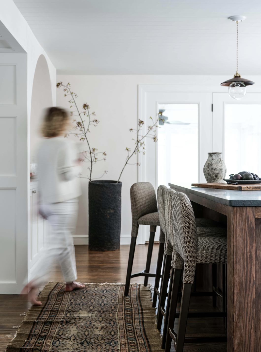
This space was originally broken up into small rooms, so we opened it up and added in some beautiful double casement windows that not only added a ton of natural light but also looked out into their large outdoor space. From there we added in a custom design range hood and a massive nine-foot kitchen island—a perfect place to entertain or have a family breakfast while also featuring plenty of built-in storage. Tadelakt plaster walls behind the hood helped create our favorite vintage mottling effect. You’ll also notice the backed stools at the island, these are our Moore House ‘Wolcott Stools’ that will be launching on our very own e-commerce site in November!
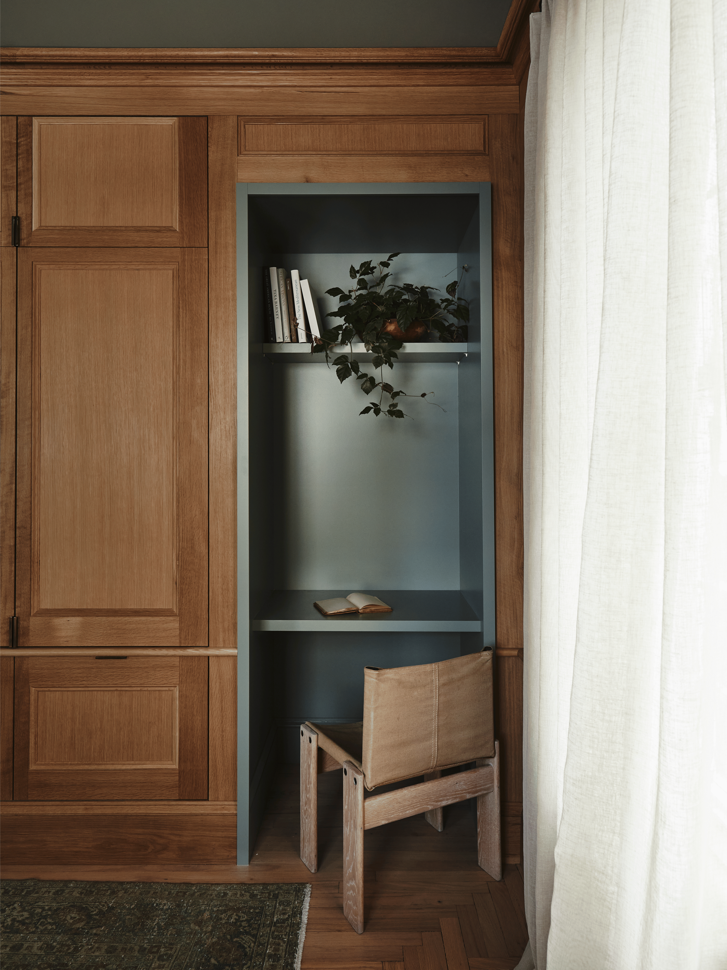
Since the ceiling in the kitchen is on the low side, we wanted to add a level of visual interest. One technique we like to employ in this situation is adding clapboard to the ceiling. We also re-oriented the entrance to the room to be centered with the kitchen island, that way you get a great view of the beautiful custom hood in all its glory. True to form, we also created tucked away stations throughout including a built-in custom coffee station with stained oak cabinets and retractable doors and a work-from-home station, so our clients could get a little work done as needed while they’re cooking a meal or feeding the kids in the morning.
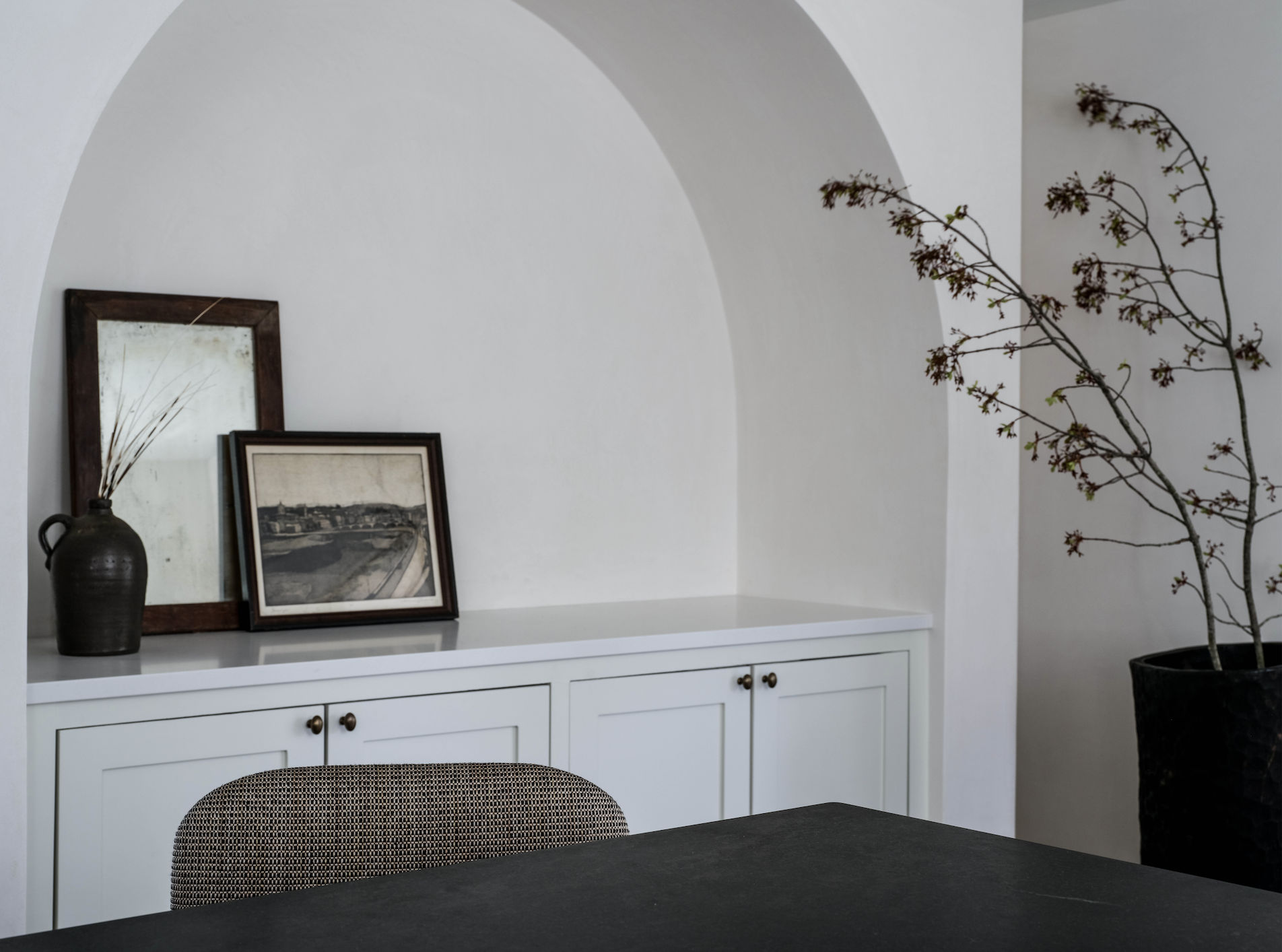
We also added in vintage elements that complemented the room—and the next phase of the project—their sunroom. We crafted a custom plastered arch bar that added movement and another great storage spot. We layered other details too like a vintage window with original, rippled glass from an old farmhouse, reclaimed double doors on the pantry, and vintage stools and styling items, to lend all the right Moore House finishing touches!
We hope you love this space as much as we do!
Images: Erin Little Photography







The Roweam Coven Bench Collection, designed by Blair Moore