How We Feel About Window Trim
You know we’re not shy about sharing our opinions on things around here. For the design obsessed, those controversial thoughts look a little different than the average. So, we’ve got something to get off our chests—we have a love/hate relationship with window trim. Window trim typically hides the gap between the sheet rock and the casing of the window, it's the fastest way to finish an unfinished edge. Ok, so we know it’s not stop-the-presses newsworthy but it’s something that comes up with all of our projects.
Our motto is, if you’ve got it, flaunt it…but if you don’t, please get rid of it! No builder-grade, box store trim here you guys. To really understand our thinking, you need to know what we’re typically renovating: old, historic homes and new builds. For every renovation, we follow two basic tenets that guide the project. We consider the architecture of the home and/or the style our client is looking to develop.
To show you a little bit more about what we mean, here are two current projects that show our different approach to trim:
Current view of the existing staircase.
Example of terminating trim.
The 1906 Craftsman
All of the incredible historic details are still alive and well in this home. These kinds of projects make us giddy with excitement. We were able to use a few of the existing details as inspiration—a beautiful staircase and the paneling in the front entryway informed our design in a big way.
Since this space already had great architectural details, we’re just enhancing the trim. In the library where we’re combining two rooms into one larger room and adding a ton of paneling (as we do), we’re adding a casing and lower panel for the formal first floor rooms. It helps frame out the window, ground the space a little more, and creates the illusion that it’s larger than it actually is. Here’s a great example of this from And Studio Interiors.
The casing details will mimic the existing design that we have around the windows, but we’ll be taking off the terminating molding at the top. We find them to be dust magnets, so if they’re not completely necessary to the design we usually get rid of them.
Take a look at this stunning rendering! Can you believe how gorgeous this is?
Where this project is starting.
Example of the color and style from Andersen Windows.
The 1980’s Colonial
This home is located in the most gorgeous area and we adore our clients, but it’s been renovated more times than we can count with a variety of materials. The interiors are a true reflection of the time period, in the eighties builders wanted to create houses for low cost on a fast timeline. The first thing to fall by the wayside was design. A lot of homeowners find themselves in this position, adding character to a newer home and we always welcome the challenge!
So here, because there wasn’t great trim to work with, we just took out was there. It made the space look more modern and we balanced that with hand crafted elements, like our Bromley sofa. Our clients love mid-century lines with touches of farmhouse comfort. So, we’re adding in a stained wood trim and some beautiful casement-stained oak windows with a flush return trim. It’s a similar look to the windows in our English Modernist project, but in a darker material finish. The key here is having beautiful windows and returning the plaster into the casing.
And this is our rendering for this same space—again a total transformation! And trim style is a huge part of that.
Whew! We feel so much better now that we’ve shared our thoughts. When in doubt, remember that trim is a part of design—so how you want to finish it, what style to use, what bead detail, sill details, casing details, apron details, and more should all be considered. Just remember classic details will always have staying power!
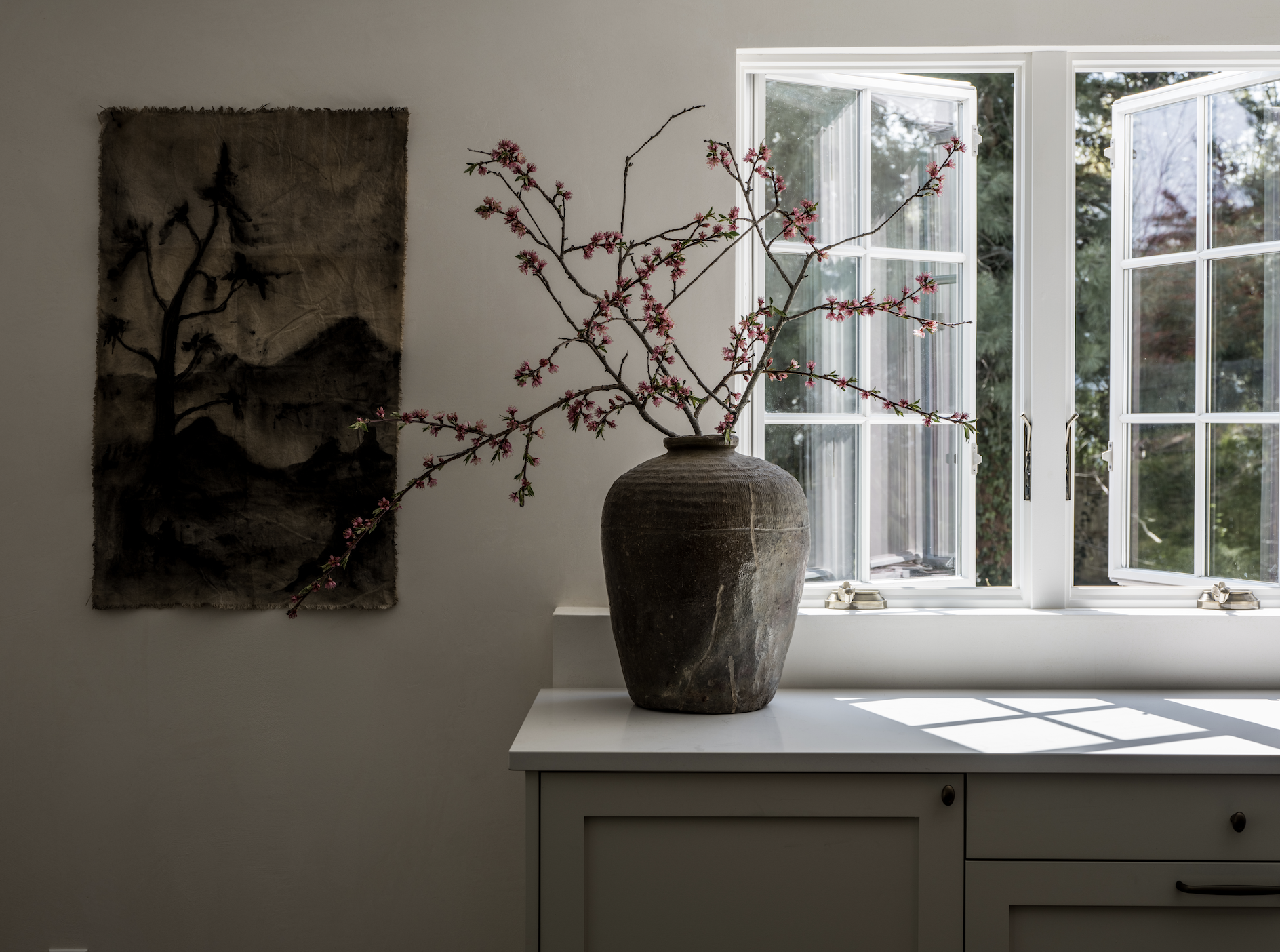
Header image: Erin Little Photography





Welcome to the Connecticut Captain’s Cottage Reveal Pt. 2