New Project(s) Alert — Two Cottages & a Cabin
It’s been a minute since we updated you on everything our all-star design team has been up to around here! For this week’s dose of design goodness, we’re treating you all to a little behind-the-scenes insight into a few of the yummy new projects we’re concepting. We’ve always got several projects going on at once, but the following three we’ve selected to showcase this week have a lot of aesthetic parallels. We hope you enjoy these sneak peeks and a selection of inspo.
The Connecticut Captain’s Cottage
SouthPort, Connecticut
A Manhattan couple seeks refuge and a little bit of funk in the renovation of their historic second home. Located in the pristine town of Southport, Connecticut, this expansive colonial cottage is roughly 6,500 square feet — with the project’s scope including the main entry, kitchen, all bathrooms, the old section of the house, a large staircase to correct flow, as well as the main bedroom suite with an ensuite closet and bathroom, and a for lack of a better word, DOPE, gentlemen’s office!
We are in the concept phase of this project with our client presentation having taken place just a few days ago! This type of historic renovation is quite similar to a few of the homes our parents restored while we were growing up, so we’re finding a bit of familiarity in her old bones. When the history of a house is present, we believe it’s part of our duty as designers to let the structure tell the story it wants to — in other words we are we are letting the architecture of the old house’s bones lead the design in our alterations. That said, our concept for this project is an amalgamation of design through the decades because we have young Manhattan clients who want to have a bit of fun with this second home as they should! We’ve drawn inspiration largely from the 60s style that was recently glamorized by the by the period drama series “Mad Men”* as well as tasteful material sensibilities pulled from the English cottage style and a touch of the colonial architectural language in the form of paneling and millwork. Our goal is for this home to exude comfort, history, and a little bit of funk! We are bound to historic town regulations for the front exterior facades but will be focusing on adding light and function to this wrap around colonial cape.
*If you’re unfamiliar with the concept of a “mad man” outside of Don Draper himself, here’s a tidbit of info since we’ve got some gals with ad and graphics backgrounds on our team! Some of you may know this and some of you may not, but the term “Mad Man” was actually a slang phrase assigned to ad executives working at agencies in manhattan during the golden age of American advertising — AKA the “time of big ideas, three-martini lunches and larger-than-life personalities who graced both the society pages and the business columns”… Hence the name of the show, and Don being your quintessential, slick, idea harboring exemplary!
Material Highlights — Light Natural Stone, Textural Plaster, Glass + Richly Toned Wood
We’ve curated a selection of images for you all that served as visual reference points during the initial design presentations with our clients
Via Pinterest
The Colorado Cabin
TELLURIDE, COlorado
Our client’s epic on piste* log cabin is in need of some serious design updates, as you may recall having seen a few weeks back in the stories of our initial walk-through! As it stands now this cabin is everything you would expect from an outdated Telluride retreat, ski house decor… antlers, quilts and all! The slopeside home is roughly 4,500 square feet — with the project’s scope including a complete overhaul of the entire space re-introducing all the classics — historic moodiness from the Victorian era, the added charm of traditional Scandinavian design and some counterculture vibes from the iconic Rolling Stones.
We’ve never felt as small as we did when were were standing among the mere 14-block town’s colorful 19th Century buildings looking up at the snow-covered 14,000 foot peaks of the Rockies. Our client’s cabin is tucked between the trees just outside the historic Victorian era mining town of Telluride, Colorado — widely known for its world-class alpine skiing. We’re history lovers here at Moore House Design so we’re having a blast learning all about the town’s significance in the development of the American West.
A ski cabin is definitely a first for us, but Blair’s over the moon because she’s been wanting a project like this for quite some time now! We’ve yet to present our initial concepts for this project, but we’re so excited about the ideas we have flowing already. This renovation is all about mixing and matching classic design styles to elevate the ski-in, ski-out retreat to its full potential and western glory. We’re drawing inspiration from the natural environment, and sussing out the cabin’s old bones to see what historic elements we can play with. Our goal is for this home to emanate a relaxed elegance through the unique combination of darker speakeasy style elements with neutral rustic flair perfectly complemented by the addition of lots of gorgeous designer and custom pieces.
Material Highlights — Dark Floral Upholstery, Natural Stone Floors, Weathered Wood Beams + Historic Panelling Details
We’ve curated a selection of images for you all that served as visual reference points during the initial design presentations with our clients
Noma Restaurant — Copenhagen, DE
Design // Studio David Thulstrup — Photography // Joachim Wichmann
The Butternut Cottage
The Berkshires, Massachusetts
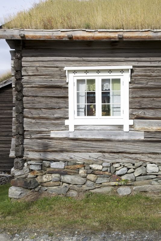
With small square footage comes creative opportunities and this is precisely the type of problem-solving that makes our team giddy. We’ll be infusing this 900-square-foot new build vacation home with the rich history of European-inspired architectural elements to soften its modern bones. The project’s scope extends to all interior spaces including the kitchen, living room, main bedroom and bathroom, guest room, half-bathroom, and library as well as exterior inspiration.
At this point in time, we are in the design process phase, preparing for a design presentation in the coming weeks. We are approaching this project a little differently than we normally would, as this is a new build instead of a historic renovation. The goal when designing within a new construction home is to ensure the space will age gracefully, but immediately have the lovely worn in feeling that comes with some of the two hundred year old homes we’ve restored in the past. We’re doing our best to “buy time” in the sense of fabricating an agedness that isn’t indicative of the time of building.
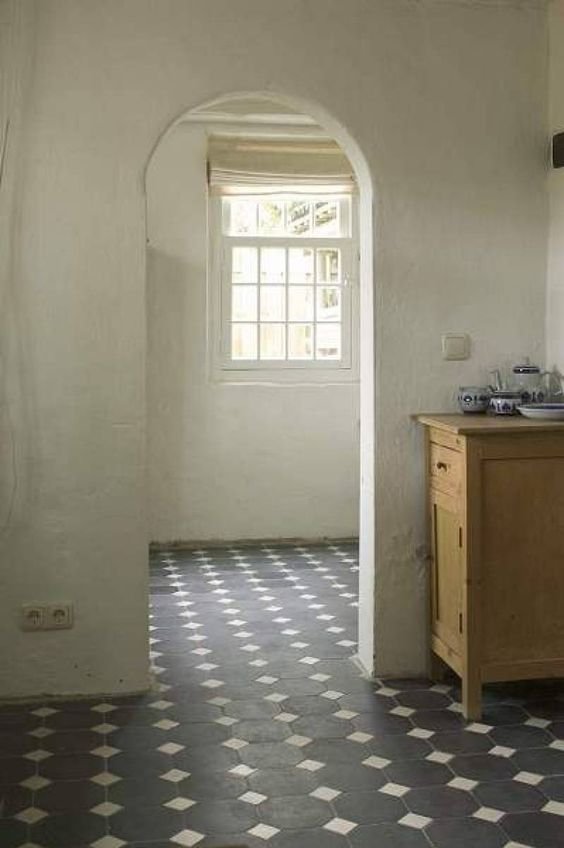
This space will play with a delicate balance between light and dark. Deep navy and greys will create structure amidst lighter toned flooring and sweet cream colors that will float throughout the rooms. This interior palette aims to invoke the loveliness behind historic architectural elements often found in timeless cottages like curved stone, linen, hand painted tile and soft wide floors.
Material Highlights — Textural Plaster, Natural Tile, Floral Wallpaper + Casement Style Windows
We’ve curated a selection of images for you all that served as visual reference points during the initial design presentations with our clients
Via Pinterest


The Roweam Earthenware Collection is rooted in reverence for the natural world—a grounded celebration of texture, form, and sustainability. This curated offering honors the quiet strength of the earth, featuring hand-hewn woods, sun-warmed ceramics, and raw, time-worn materials that echo ancient landscapes. Designed to elevate interiors while paying tribute to the places that inspire them.