Dining Room Designed by Moore House Design // Photography by Jared Kuzia // Styling by Hudson Moore
A country club respite for our busy professional Bostonian clients.
Our clients met in college and have been weekending at the Aquidneck Club every summer for the past 20+ years. The condos within the original clubhouse seldom come up for sale and gather a loyalist following. Our clients jumped at the chance to be a part of the club's history for the next generation. Much of the club’s exteriors reflect charming Shingle-style New England architecture. Still, the internals had succumbed to dated late 90s and early 2000s renovations of inexpensive materials void of craftsmanship.
Exactly what we like to get our hands on!
Our client’s aesthetic balances on the scales of hyper minimalism, clean surfaces void of visual clutter. Our palette of color, materiality & textures kept to this notion whilst generating movement through vintage lighting, comfortable upholstery, and unique forms of art.
Kitchen Designed by Moore House Design // Photography by Jared Kuzia
— THE KITCHEN —
Our vision for the Minimalist Club project was to connect with the surfaces that evoke a sense of respite. In a world filled with so much conversation and visual and virtual noise, the word "respite" stands out. The design balances hard lines where necessary and soft lines that dissect the function of form. Skilled makers and artisans carefully crafted the Island to seamlessly flow into the floor line.
Although modern, the craftsmanship within this project was meticulous. From woodwork to stonework, plaster, concrete to glass fabrication, all the materials used in this project are locally sourced and hand-poured by skilled craftsmen. Sakonnet Woodworking custom-made our cabinetry with Livingstonstone Concrete, which casts the curved island counters and backsplash. Urban bronzed finished Plumbing and a few of my favorite items featured below from ROWEAM.
Miniature bronze head sculpture. This ancient face with a weighted base stands alone as an abstract conversation piece. Origin unknown. — Bronze Dre Head, sourced by ROWEAM.
Tall stoneware vessel with applied handle in white finish. — Jenna Vessel, sourced by ROWEAM.
Stoic Faces. Crosshatch and Stippling. Ink on parchment. Signed G. Youse. Framed in glass and stained wood frame. Frame showing wear consistent with age. — Faces Drawing, sourced by ROWEAM.
Kitchen Designed by Moore House Design // Photography by Jared Kuzia
— LIVING ROOM —
Our goal was to strike a balance between using minimal lighting and incorporating vintage details. We created a double vaulted living room that feels light, and airy and has a sense of enclosure. To achieve this, we found suspended pendants with glass globes that appear to float in space. The pendants are suspended by a small disc, illuminating the globe and creating a stunning glow. We positioned the pendants just above the vertical V-groove paneling so they would slightly hit the dining room ceiling.
Our ROWEAM Buff sofa was designed with modern apartment living in mind. It has a clean and contemporary shape, but we collaborated with our namesake firm, ROWEAM, to ensure it is also incredibly comfortable (we plan to launch it next year). The sofa is layered with down and feathers but woven, so the filling does not settle or require fluffing. We sourced a flat weave rug from Minor Casa to unify the living and dining rooms. The rug is simple yet elegant, and it helps to connect the two spaces. We also added a mid-century side chair, reupholstered in a houndstooth wool fabric. It is a fun addition to the space and complements the modern shape of the sofa. We added a few accessories from ROWEAM and the Travertine Lamp of our dreams to complete the look.
Living Room Designed by Moore House Design // Buff Sofa custom by ROWEAM // Photography by Jared Kuzia
Living Room Designed by Moore House Design // Sofa & Decor by ROWEAM // Photography by Jared Kuzia
- Shop The Living Room -
Oversize travertine table lamp at 24.5" tall, this Asian-inspired sculptural lamp has a weighted travertine base and verdigris metal body. An empire-style metal shade and finial complete each piece. — Travertine Table Lamp, Sourced by ROWEAM.
A stunning 18th-century French oak side table. Exquisite patina. Wear consistent with age. — French Oak Side Table, Sourced by ROWEAM.
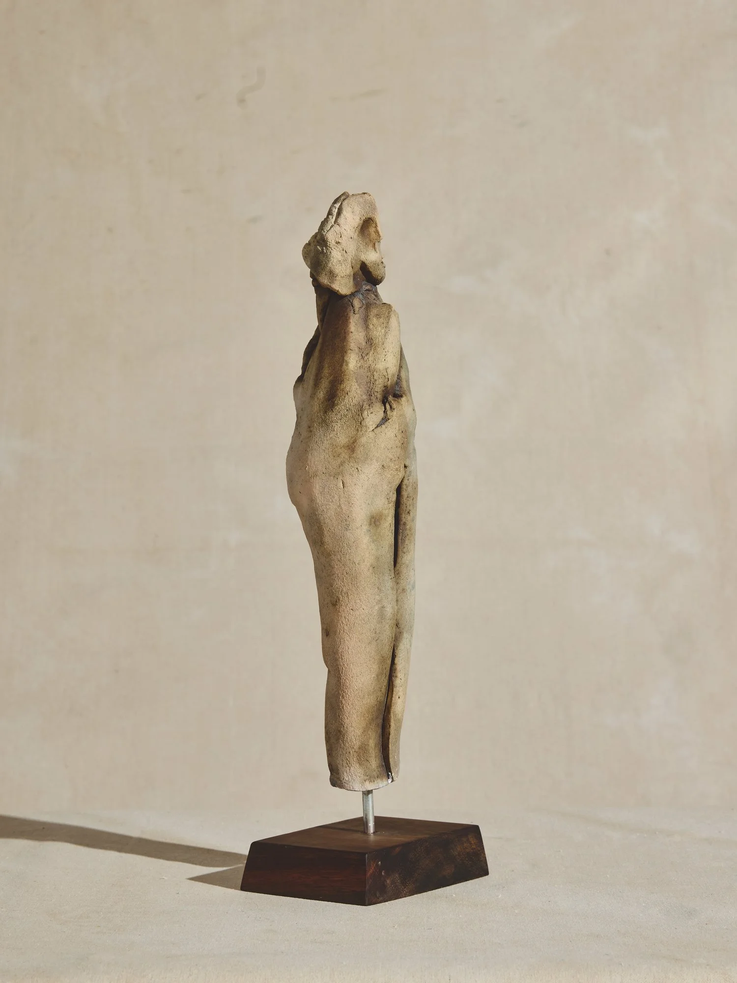
Abstract figure on a wood pedestal, artist OZwaig. This ceramic sculpture with a rough resin finish shines in color and shape. At first glance, one figure is seen, slightly rotating the sculpture, and it would appear two figures are embraced. A subjective interpretation for a true collector. — Abstract Figure, sourced by ROWEAM.
Dining Room Designed by Moore House Design // Rhody Table, Art and Decor by ROWEAM // Photography by Jared Kuzia
— DINING ROOM —
We have a custom-made "Rhody Table" by Roweam in the dining room, launching in 2024. It was designed to fit the space and is paired with ROWEAM Javor Pivka chairs upholstered in tumbled leather and a masculine blend of wool Houndstooth. The Lady Reading Oil on Canvas artwork creates a sense of calm yet still feels slightly off-kilter. I love to have something in my interiors that pushes the boundaries, as it makes conversation and uniqueness when viewing the space. The ceramic meandering semi-flush mounts for the ceiling lights trail off to the left to connect the living room and dining room without being too contrived in one location, like a central floating saucer.
- Shop The Dining Room -
Designed to add a sense of modernity to our 200+ year-old Coaster’s Chance Cottage, this table features unique leg turnings complemented by stunning custom stain options that accentuate the natural wood grain.
Shown in our ebony finish. — NBL Dining Table by ROWEAM
Oil on canvas. Signed Nicolai Anderson. 1938 Exhibition sticker on back. The wood frame has minor warping. Canvas and frame wear are consistent with age. — Lady Reading on canvas by ROWEAM
Designed in the 1970s by manufacturer Javor Pivka in Yugoslavia. These chairs are quadrangular in shape and made from beech wood. Reupholstered in a Hickory brown leather and 100% linen beige-and-black plaid houndstooth. — Javor Pivka Chairs by ROWEAM
Library Office Designed by Moore House Design // Furnishings sourced by ROWEAM // Photography by Jared Kuzia
Library Office Designed by Moore House Design // Furnishings sourced by ROWEAM // Photography by Jared Kuzia
Library Bathroom Designed by Moore House Design // Jenna Vessel sourced by ROWEAM // Photography by Jared Kuzia
— LIBRARY OFFICE & OFFICE BATH —
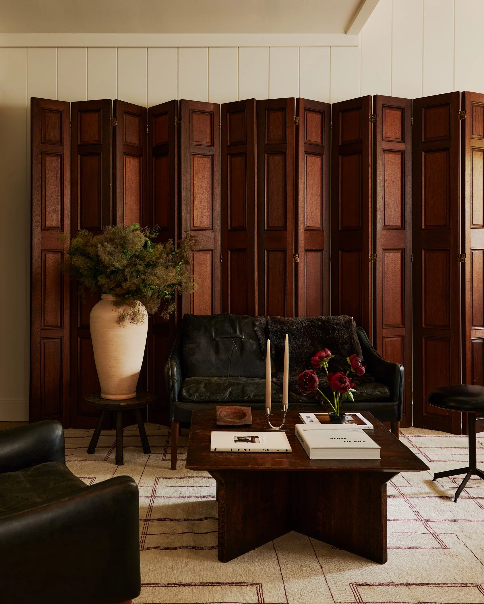
Our goal for this space was to create a cozy breakaway area for our clients to work from home, with a warm and inviting atmosphere similar to a library. However, we wanted to achieve this without breaking the bank on expensive mahogany paneling. Since this was a second home for the clients, we needed to find a cost-effective strategy. After some research, we discovered these beautiful mahogany room dividers from one of our vintage vendors, and they became the focal point of the room. We then complemented them with a mid-century Hans Olsen settee and chairs, a French 1930s coffee table, and a hand-woven rug from Nepal. The combination of these elements created the perfect ambiance we were aiming for.
There is a smaller bathroom located on the main floor that serves the entire living space on the first floor, as well as the bedrooms located on the floor above. I particularly enjoy having one bathroom that reflects our signature broody style. Recently, I came across some vintage stone tiles from Paris that have a beautiful marble veining. The tiles are slightly ballooned in the center, which creates a subtle movement towards the grout lines. The color is a perfect gray, almost resembling the color of an elephant's breath.
Main Bedroom Designed by Moore House Design. Furnishings, Lighting, and Decor sourced by ROWEAM Photography by Jared Kuzia
The main Bedroom was Designed by Moore House Design. Furnishings, Lighting, and Decor were sourced by ROWEAM Photography by Jared Kuzia.
— MAIN BEDROOM —
Our main bedroom wanted to be calm and textural for our clients. We custom-made a King-size bed with a lower, more minimal headboard to let the ceiling draw the attention. To patinated vintage sconces and a Petite wooden French bench with radius ends that has the most beautiful, rich, and subtle patina, our custom New Vintage Ghent Side Tables from ROWEAM in natural stain and layered with my favorite Swedish vessels of all time, anything Gunnar Nylun. The little desk nook wanted to be airy and simple with a metal and leather-topped desk and our Javor Pivka chair.
— SHOP THE MAIN BEDROOM —
A yellow figure-inspired vessel produced by Swedish designer Gunnar Nylund circa 1930's. In mind condition. — Gunnar Nylund Swedish Vessel sourced by ROWEAM
Sleek and sophisticated, our petite Ghent side table in solid white oak is a modular masterpiece. Stacked with storage, featuring soft-close inset drawers and push latch hardware, this minimal side table is fit for a bedside chest or end table. - Ghent Night Stand made by ROWEAM
Petite wooden bench with radiused ends. Delicate and aged, its patina patina is unmatched. - French Bench sourced by ROWEAM
— MAIN BATHROOM —
The original main bathrooms had been fitted with drop ceilings and builder-grade trim and tiles, which were not up to the client's expectations. Our team collaborated with local artisans to craft a modern aesthetic while adding antique finishes, vintage materials, and high-quality products. We imported plumbing fixtures from our motherland, Australia, and had the vanities custom-made by local craftsmen. The custom sinks were created by local concrete artisans, resulting in a modern take on a Moore House Designed bathroom.
Bathroom Designed by Moore House Design // Photography by Jared Kuzia
Bathroom Designed by Moore House Design // Photography by Jared Kuzia
— shop the main bathroom —
These petite silver bowls are multifunctional and utilitarian. Stand-alone or set the table with a grouping. These streamlined bowls make beautiful catchalls, sauce bowls, and ring dishes. Engraved. - Hotel Venice Tiny Silver Dish sourced by ROWEAM
Ceramic tapered bowl with high-fire aqua glaze. Stamped. — Ceramic Stamped Bowl sourced by ROWEAM
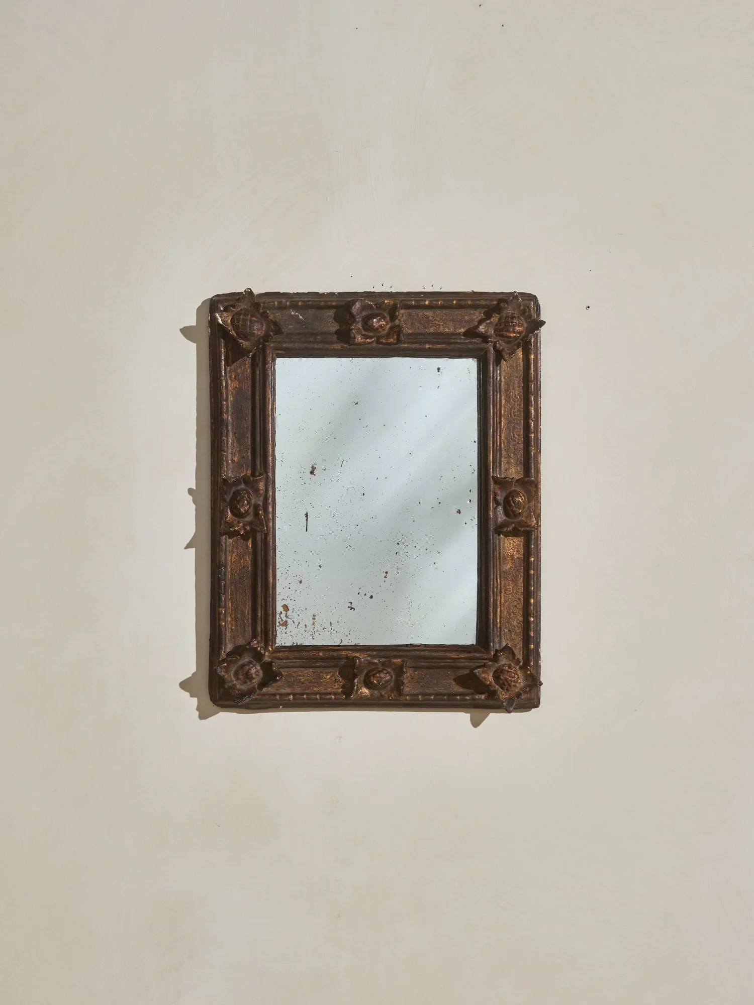
Ornate 18th Century Barcelona Mirror with engraved border reliefs and applied wooden floral carvings. Distressed mirror. Intended for vertical hanging orientation. — Ornate Barcelona Mirror sourced by ROWEAM
— THE GUEST BEDROOM —
The clients have many friends who visit them at the club to play golf, so they wanted to create a separate sleep space in the narrow room. Since I prefer having some privacy even when sharing a room, we divided the space into two zones using a v-groove-divider in the center. We added some charming sconces with ceramic pull chains to create a cozy reading nook.
Guest Bedroom Designed by Moore House Design - Side Table, Vessels, Art, and custom Bromley Bed sourced by ROWEAM - Photography by Jared Kuzia
— Shop the guest bedroom —
Mid-century modern polished brass table lamp. It boasts a deco base detail with a minimal frame and new, custom linen shades in monochrome gold fabric. — MCM Brass Lamp sourced by ROWEAM
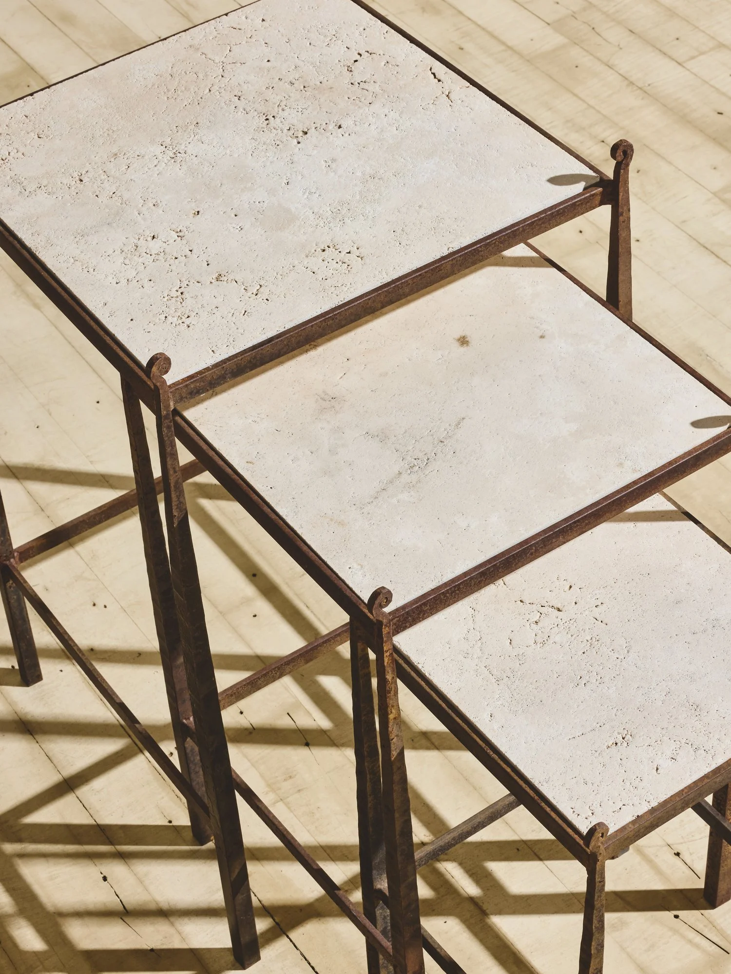
Beautifully patinaed travertine nesting table. Curved finial stands are subtle and decorative on traditional-aged metal frames. - Travertine Nesting Tables sourced by ROWEAM
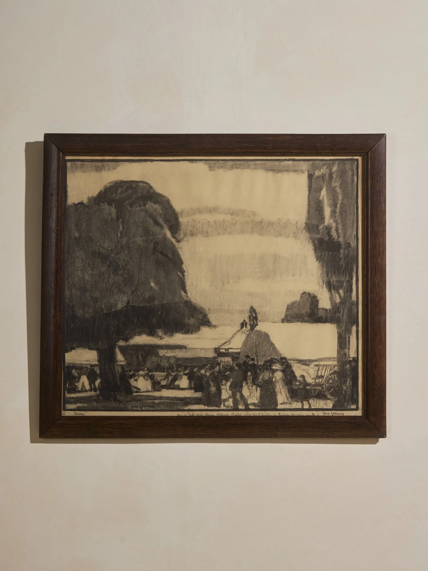
Day in the Village. Charcoal on paper. Signed. Stained wood frame. — Villagers Charcoal Sketch sourced by ROWEAM
We know you’re going to ask…..
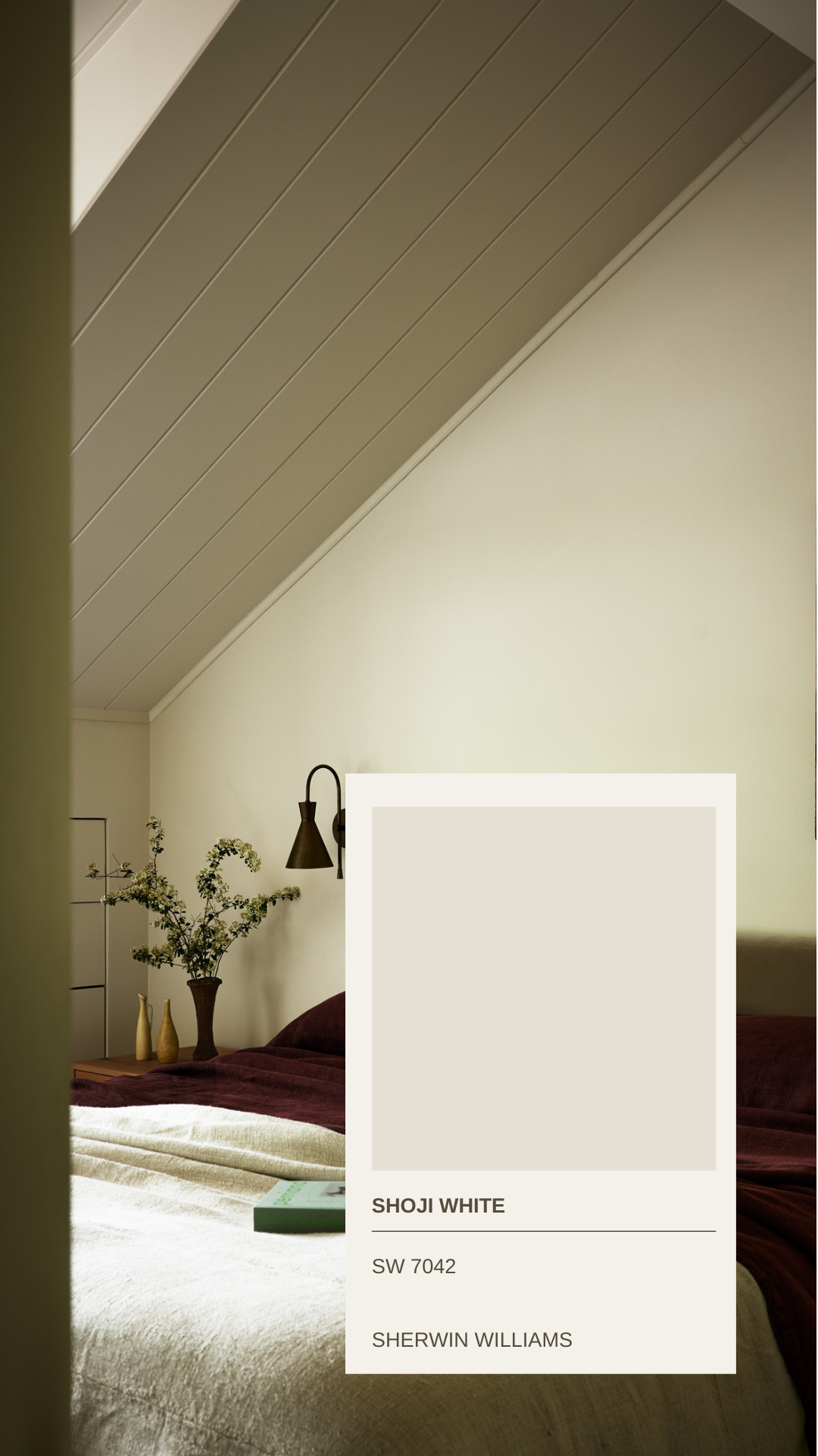
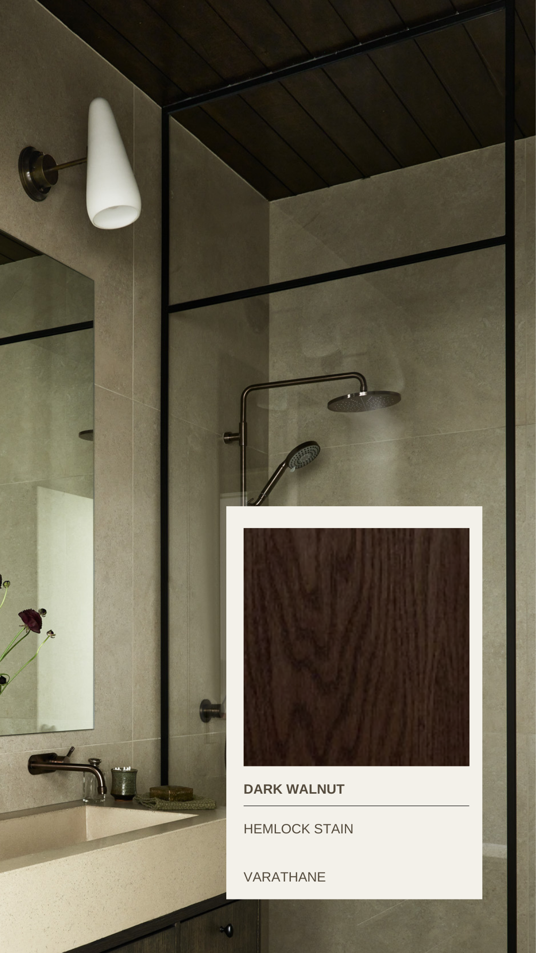
Paint Colors
— Project & Renovation Scope —
Complete Renovation & Furnishings Project by Moore House Design
Interiors only consist of two floors: Living Room, Dining Room, Kitchen, Office, Office bathroom, main bedroom, main bathroom, guest bedroom, and guest bathroom.
Designed by Moore House Design // Furnishings made or sourced by ROWEAM
Photography by Jared Kuzia // Styling by Hudson Moore // Location of condo The Aquidneck Club













The Roweam Earthenware Collection is rooted in reverence for the natural world—a grounded celebration of texture, form, and sustainability. This curated offering honors the quiet strength of the earth, featuring hand-hewn woods, sun-warmed ceramics, and raw, time-worn materials that echo ancient landscapes. Designed to elevate interiors while paying tribute to the places that inspire them.