Moore House Approved Material Breakdown
Materials completely make or break a space so naturally they’re hardwired into what we do as interior designers. There is such a thing as a well designed space with harsh material selections, and a poorly designed design with nice material selections. Obviously the goal is to create a great design with great material selections. Everything in design is all about balance…and knowing when to break that balance to create something beautiful and meaningful. We’re giving you the low-down some of our favorite materials to give you a little insight to how we create our layered, broody interiors. So here’s the breakdown of our favorites…
Plaster
When looking to add depth and dimension to a space, plaster is always at the top of our list. It can be pricey, but there are so many different varieties of the material & topical treatments, like lime wash, at different price points you’re bound to find an option that works. We’ve been working with plaster for a few years now, and it’s one of those materials that due to its rich historical application, connotes a sense of age. Plaster dates back to Neolithic times and has been evolving as an artform and architectural/decorative material ever since. A few different types of plaster that may ring a bell are “tadelakt”, “venetian”, “limewash” and “slaked lime”… all of which are gorgeous in their own unique right. The thing we love most about plaster is it’s soft but dynamic earthen quality. The way the light plays off the organic surface is unparalleled as far as material finishes go. We truly fall further in love with this material after each project, so we’re happy to see it coming to life more in recent years ~ if you’re looking for more info on plaster we suggest hitting up Master of Plaster. Lauren and her family are a pleasure to work with and have taught us SO much about this craft we can’t even begin to summarize it.
A few of our favorite projects featuring plaster // Coaster’s Chance, A Minimalist Retreat, and our English Modernist.
Wood in All Her Glory
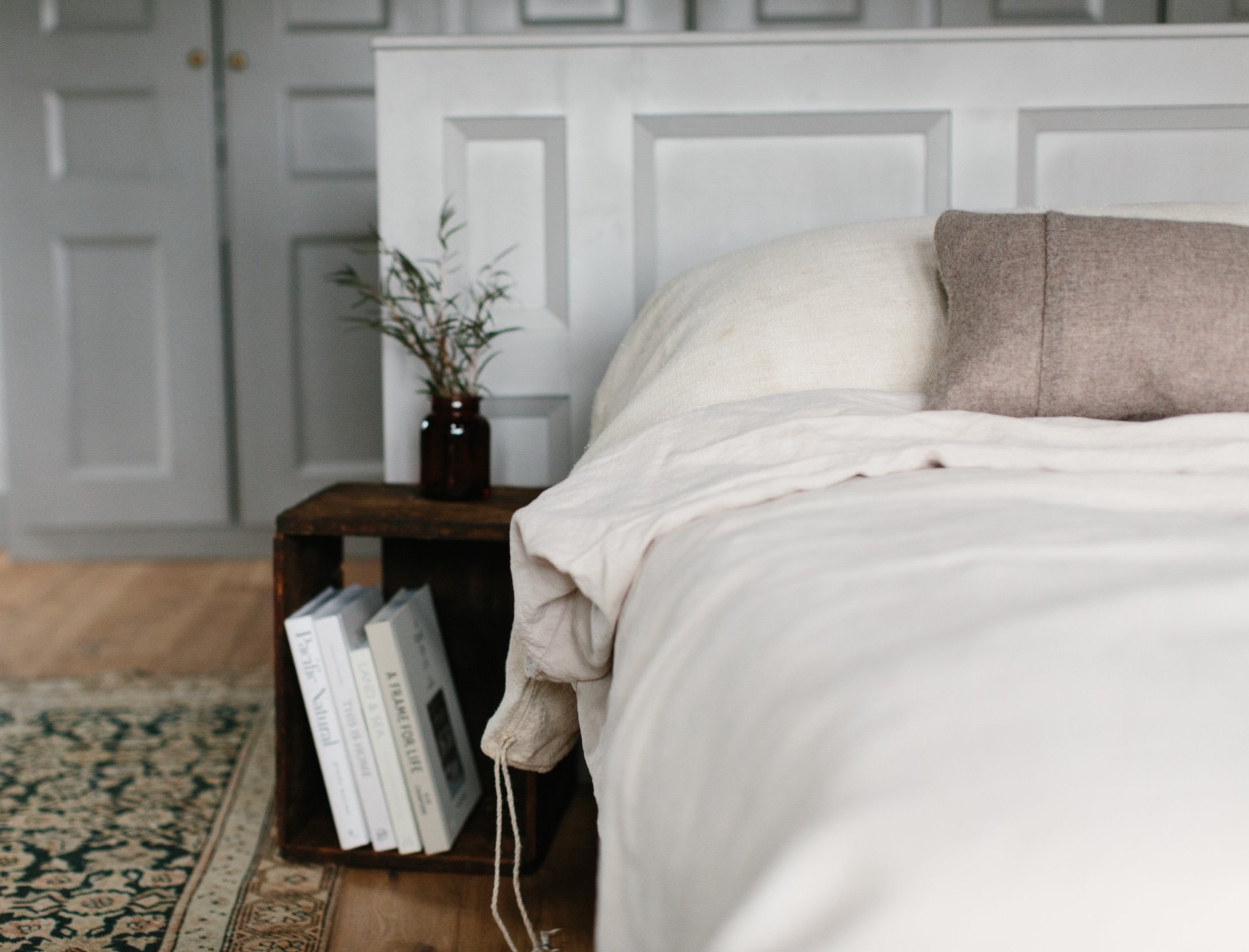
Panelling has been used for hundreds of years to cover any imperfections that could be seen in structural walls, insulate by reflecting radiant heat from wood fires, making heat flow evenly throughout the space & as a decorative element to elevate space. It’s no secret that we LOVE panelling & applied mouldings here at Moore House — this may be partially because our Dad is a bit of a woodworking magician. Our journey as interior designers began as we started paying more attention to the design choices of our parents in the midst of their serial flipping habits. A lot of these homes were older so they lended themselves nicely to wood finishes, so wood will always hold a soft spot with us. Panelling in particular is one of our favorite wall treatments because of its innate ability to create visual cues to a certain time period or style. Sometimes the spaces we are called into already have a little bit of paneling — if it’s good, we’ll run with it so the home retains some original character. As a general rule, paneling & various applied wood treatments are super easy to maintain and never really go out of style.
So there’s wood and then there’s wood, right? We’ve addressed paneling and the more buildable ways it can be used, but we’d be seriously whiffing if we didn’t also address wood as a natural, rough, imperfect material. When we’re looking to add a natural softness to a space that is on the edge of feeling too new, we always like to add something that’s super rustic and warm feeling. This usually comes in the form of a sideboard, milking stool or maybe even replacing the entire floor of a room with wide plank reclaimed wood. We love the way different wood tones can mix together to a create layered look. Natural wood will never leave our interiors, whether it’s just a little detail or an entire room, because it brings the outside in and makes us and our clients feel warm and at ease.
A few of our favorite spaces featuring either paneling, built-ins or natural wood // The English Modernist, The Vintage Brutalist, The Pavilion Apartment , A Minimalist Retreat & our 18th Century Farmhouse.
Paint
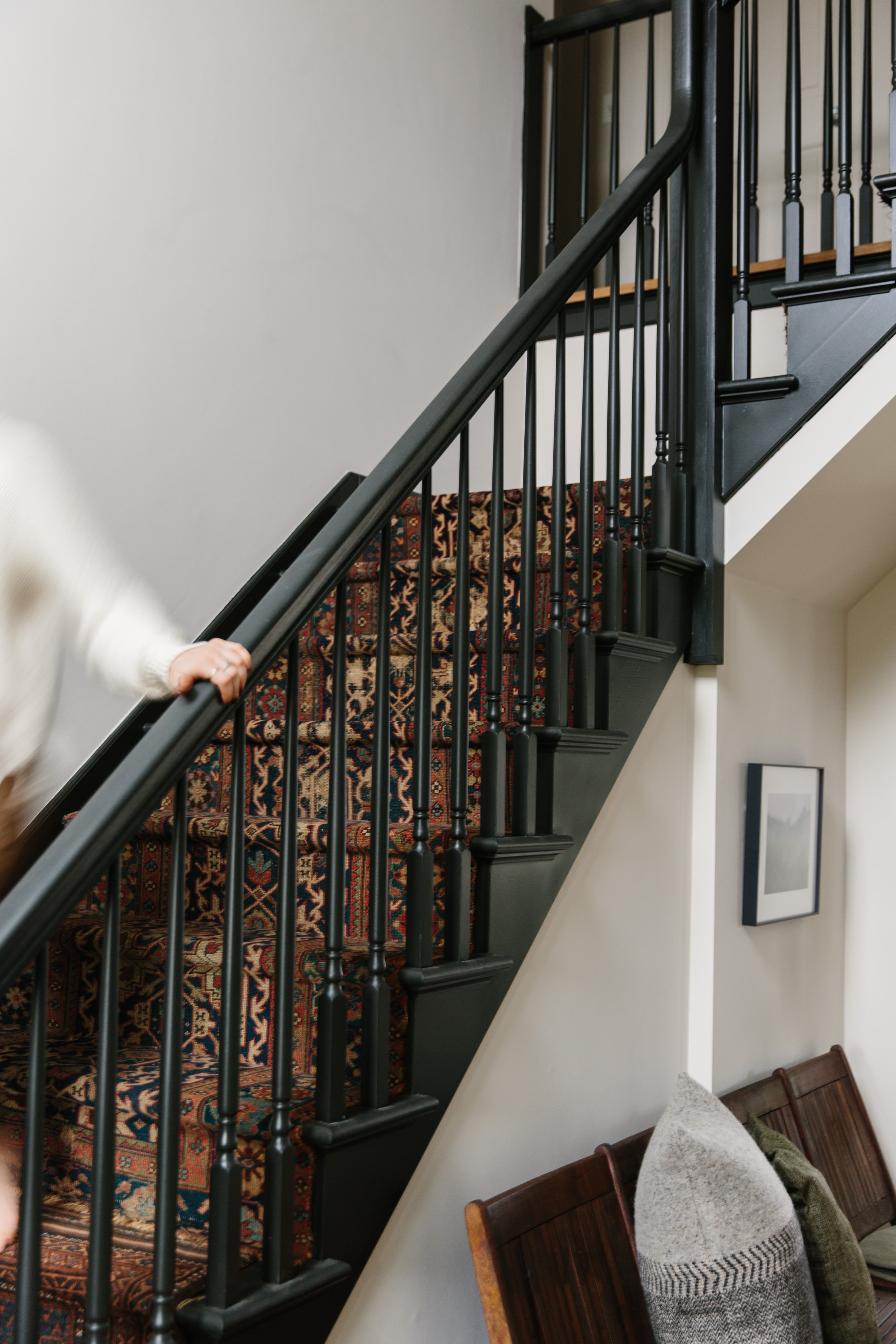
It’s amazing how much a simple coat of paint can transform a space or even an object. It’s really all about creating contrast and visual interest. We love using smart paint selections (particularly dark tones) to set the mood of a room or highlight a certain element like a staircase or built-in nook. Paint is also great because it’s low-cost — probably the lowest cost interior material finish there is! Also, you’ve probably heard it before, but the hardest color to pick without a doubt is “white” because there are so many subtleties and the way light can affect it. That said, picking paint colors in general can be tricky so if you’re looking for a little more help check out our most recent paint blog (yes, we’ve done a few on the subject).
A few of our favorite projects featuring bold paint // Coaster’s Chance, A Minimalist Retreat, Playroom meets bedroom, and our English Modernist.
Stone & Affordable Alternatives
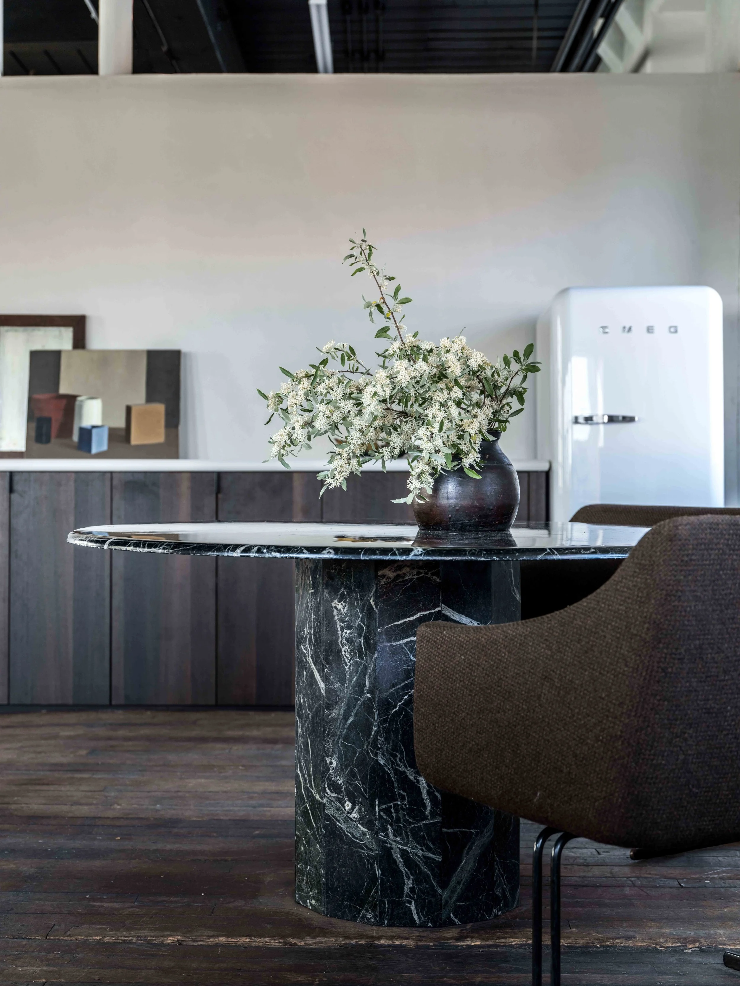
Stone is a super rich looking material that almost automatically evokes class it’s also an authentically individual material as no two slabs are the same. Stone is durable and pretty low maintenance depending on the variety selected. Some of our favorite stones are soapstone, travertine and of course marble. Each of these stones has a wide range of beautiful patterns and textures. Think of them kind of like patterns of fabric, but even more widely varying and unrepeatable.
The only downside of stone really is that it can be very expensive, which unfortunately often knocks it out of the running in many client projects. But, being a designer involves a lot of creative problem solving to get the client the best solution possible within any restraints. This is where our creativity thrives, if we always had a deep wallet we wouldn’t come up with some of the solutions we have in the past because it wouldn’t have been necessary. Sometimes it means adding the material in a smaller form, like an end or coffee table instead of an entire kitchen counter and island. One of our favorite examples of a stone alternative is concrete. In our Minimalist Retreat Project we created a soapstone look-a-like sink cast out of concrete… Can we just say epic for more reasons than just saving money?
A few of our favorite projects featuring Stone or look-a-likes // A Minimalist Retreat, The COlonial Modernist, The Belgian Mid century and our English Modernist.
Tile
Tile is another one of those materials that comes in a wide range of colors, finishes, shapes and sizes — thus endless interior outcomes. Tile is great for areas of a home or space that get high traffic or have a lot of moisture, which would explain why we commonly see it in bathrooms, kitchens and mudrooms! We don’t go overly crazy with tile, but we’ve got a few projects coming up that feature some pretty epic tile work. We love playing with patterns and mixing materials and tile lends itself to playful designs particularly well. It’s a simple way to add rich details to any space that are easy to keep clean.
One of our favorite kinds of ceramic tile is what’s known as “zellige”. This tile, like plaster has a rich history and is by no means “new” though it’s gained traction with many interior designers recently. We love it because it has a handmade feeling that still looks visually clean. The way all the little imperfections and slight angles reflect light adds a subtle romance to a space. We’ve used zellige once before and three years later it’s still looking gorgeous as ever… All we can say is that sometimes a wall of this can be so beautiful we don’t want to leave it for just the half-bath!
A few of our favorite projects featuring Tile // The Pavilion Apartment , The Minimalists Club, and our 18th Century Farmhouse.
Fabrics & Upholstery
Okay so this is kind of broad section, but if we went too far into this we’d be here for the next month and a half, so we’re doing a shallow dive for now! Where would we be as interior designers without fabrics? *Nowhere* We use a lot of fabrics within every one of our designs partly because we like the visual softness and partly because there are so many applications — curtains, upholstery, rugs, and pillows. An interior without fabrics is like a life without joy. Where most people get tangled up is in the mixing and layering of different fabrics. We like airy sheer curtains that maximize natural light (many of our projects are in New England so there isn’t a lot of light in the first place) ~ we also did a blog on curtains so if you missed that or need a refresh find it here!
When it comes to seating we often gravitate towards linen because it’s clean looking but has that subtle touch of handmade fibrousness that softens the whole piece. Chairs we like to get a little funkier. Being on the smaller side we often take accent chairs as an opportunity to have fun, take a risk or add depth. We love when a good leather chair has been worn to perfection — it honestly makes us giddy. The key for us is selecting fabrics that maybe visually we want a touch of, but if it were to cover a whole sofa it’d be too much. Something else we need to mention is our reupholstery practices. You could call it a lifestyle for us at this point. We love finding vintage pieces and up-cycling them with new legs, fresh fabrics or fringe if we’re feeling saucy. We’ve talked about up-cycling before but it’s a really great way to reuse and repurpose which we all need to do more of. The added bonus is that it’s probably going to be cheaper than buying a similar piece new though this can change if you select a super ritzy fabric!
favorite upholstery, window treatments & nooks // Coaster’s Chance, A Minimalist Retreat, The Vintage Brutalist, and The Belgian Mid Century.
Now that we’ve given you the run-down on materials as they are in the form of interior finishes, it feels like a good time to mention that they need not only live in that form! This is where layering comes into play… When we’re looking to add a touch of texture or maybe a pop of color, styling pieces like art and decor are our friends.
Styling With Materials
We like to think of styling as an opportunity to add whatever it might be your space is missing after all designed items are installed. Styling pros make it look so simple, but creating those jaw-dropping moments is no small endeavor… it takes loads of experience and honestly a really good eye. Highly esteemed stylist, Colin King, said with regard to tricks-of-the-trade, “Negative space and asymmetry. Edit, edit, and then edit some more. I remove and add, playing with different combinations of objects until I find the contrast in an arrangement that seems like they shouldn't make sense together but somehow do. I am inspired by nature and what nature produces—nothing about nature is linear or symmetrical or immune to decay”. We’ve always found the editing part to be time consuming, but also fun! You might remember that we broke styling down in a previous blog so if you’re in search of a bit of a how to, look no further.
That wraps up our thoughts for now, but we hope all of this info gave you a bit of insight into our design brains. Please don’t hesitate to drop any thoughts or questions in the comments section below!
Images: Erin McGinn Photography, Erin Little Photography and Zack Dezon.


The Roweam Earthenware Collection is rooted in reverence for the natural world—a grounded celebration of texture, form, and sustainability. This curated offering honors the quiet strength of the earth, featuring hand-hewn woods, sun-warmed ceramics, and raw, time-worn materials that echo ancient landscapes. Designed to elevate interiors while paying tribute to the places that inspire them.