The Afternoon and Dining Room Reveal
We’ve shown you a few spaces original to the cottage in our Captain’s Suite and Wheelhouse Loft Reveal, but there’s more! Brimming with New England charm, these spaces feature 200-year-old horsehair and plaster walls, warm wood tones, and wide-planked floors — quite the setting for some of our favorite custom-designed pieces. We don’t like holding these kind of secrets, so it’s a relief to finally be revealing the last spaces in our Coaster’s Chance cottage — the Morning Room and Dining Room!*
— THE AFTERNOON ROOM —
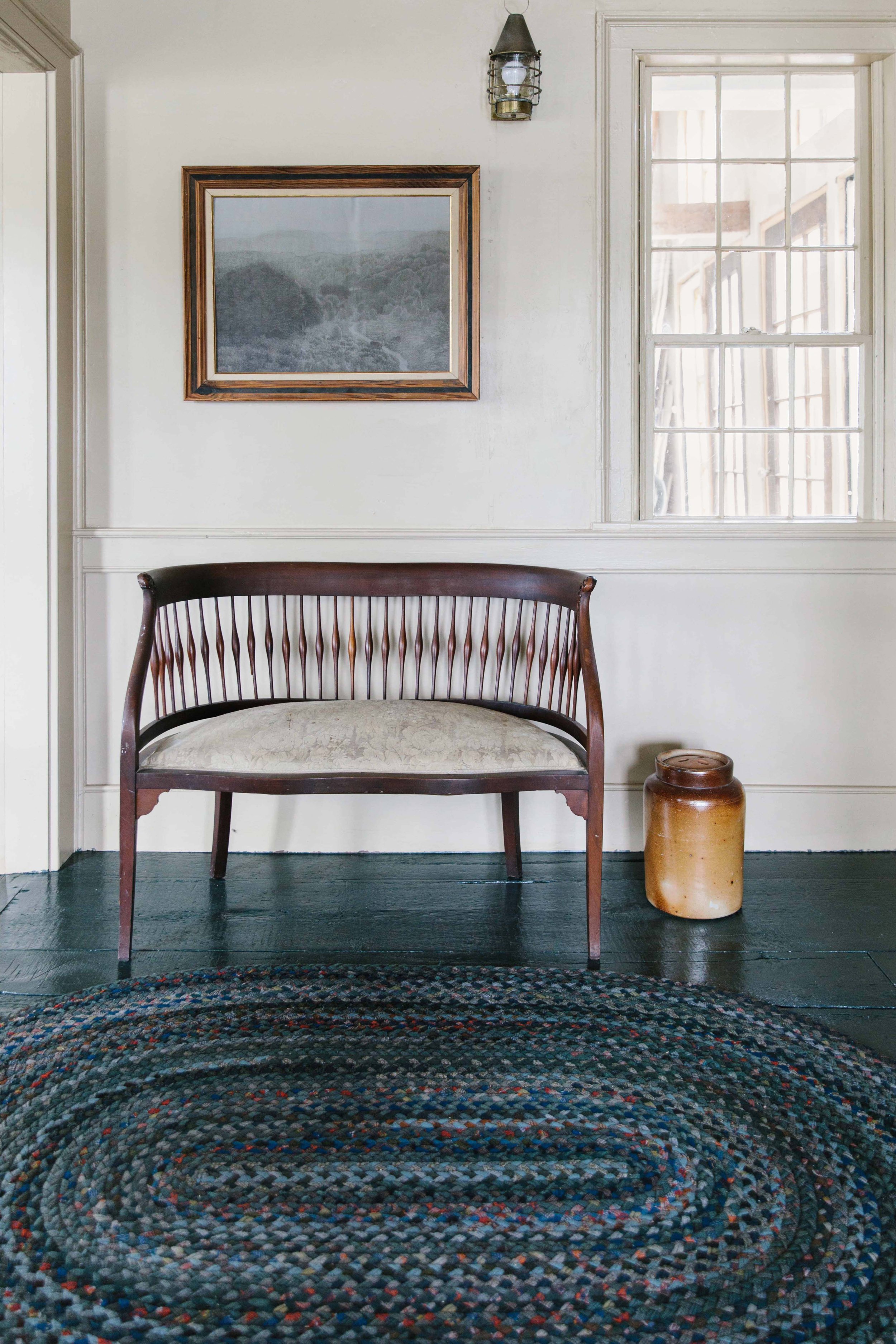
We love this room for her natural light with both southern and western facing windows she beams in the afternoon hours, hence her name. Something else we love are the views overlooking Cutler harbor — when you’re seated in this room, you’ll only see the water and trees, no lawn which we think is pretty neat. We made some minor cosmetic updates that gave way to some major final results, not to mention all of the vintage and custom-designed pieces we added!
One of the biggest undertakings in this space was actually the “aging” of the wallpaper. This cottage was built around 1820 using traditional building techniques of that period i.e. horsehair and plaster walls. We’re all about highlighting the history of a home where we can, so when we saw what the original walls looked like behind some of the partially peeled back wallpaper, we knew we wanted this look throughout the room. It was a slightly bigger project than we had originally thought because much of the wallpaper was still VERY securely pasted to the plaster. Our team went at it with razor blades, putty knives and sandpaper to expose as much of that original plaster as possible. As we were working, we started to fall in love with the map-like look of the two materials and ran with it — adding a bit of coffee colored paint slurry over the top to soften the contrast. The outcome felt aged and imperfect like something out of an abandoned historic homestead.
Next up were the floors. We talked about this process previously in our paint blog, but we’ll give you a little refresher. The wide-plank flooring is original to the cottage, and just needed a fresh coat of paint… or three. We gave them a little sand to remove some of the old paint and then three coats of Cascades by Sherwin Williams to achieve this endless looking deep green. The only other cosmetic update made was to the raised brick hearth of the colonial cooking fireplace. Centuries ago this room would have been the heart of the house — the kitchen! We temporarily removed the wood stove for safety reasons (the chimney needs to be partially rebuilt and inspected in order to become functional again) but the fireplace remained and needed a fresh coat of paint. Black paint works really nicely inside fireplaces and will help hide the ash and charcoal when the stove goes back in place.
We’re not entirely sure why, but this room has always felt really romantic to us…it almost sends us into a Pride & Prejudice time warp. The petite, round-backed tea chairs are definitely part of it. They were added by our grandmother decades ago and are the perfect size for this colonial-scale room. We had them reupholstered with a soft velvet from Kravet Fabrics that sort of reminds us of a field mouse’s fur, then added a little silk fringe for fun. Not to toot our own horn, but our Bromley loveseat seems to look perfect wherever we put her. We just about died when we saw how nice she looked on top of the gorgeous vintage rug Passerine sourced for us!
It’s safe to say we’re definitely fond of coffee tables. We had a few options picked out for this space, but the one seen above was our final selection. It’s a vintage industrial furniture dolly that’s aged to perfection and felt a little unexpected to us. Plus, it brought some rustic depth to the space! Super low coffee tables are only cool when you don’t actually have to reach down all the time for your coffee, so we placed a small iron-clad trunk on top of it to create a bit of height for function’s sake.
As we’ve said, this cottage had a lot of original charm, which was partly due to the whimsical country curtain style. We opted to keep this style going and had fresh ones made in a lighter linen to avoid any visual heaviness! Something else we love in this space is the lamp with the accordion shade. We know… accordion shades are having a moment, but we really do love them. This antique table lamp felt a little modern in the space, but in the cool grandma type of way so we were totally into it.
As you know by now, we feel very strongly that a space cannot be complete without art. We’ve come to realize over the years that many people think portraits can be creepy! We’re here to prove them wrong, though you won’t find us putting portraits of clowns all over the house so we guess SOME exclusions may apply. The “Old Gentleman” print from Vintage Supply is just what we were looking for here — a nod to the weathered sea-captain that likely built this cottage 200 years ago.
— THE DINING ROOM —
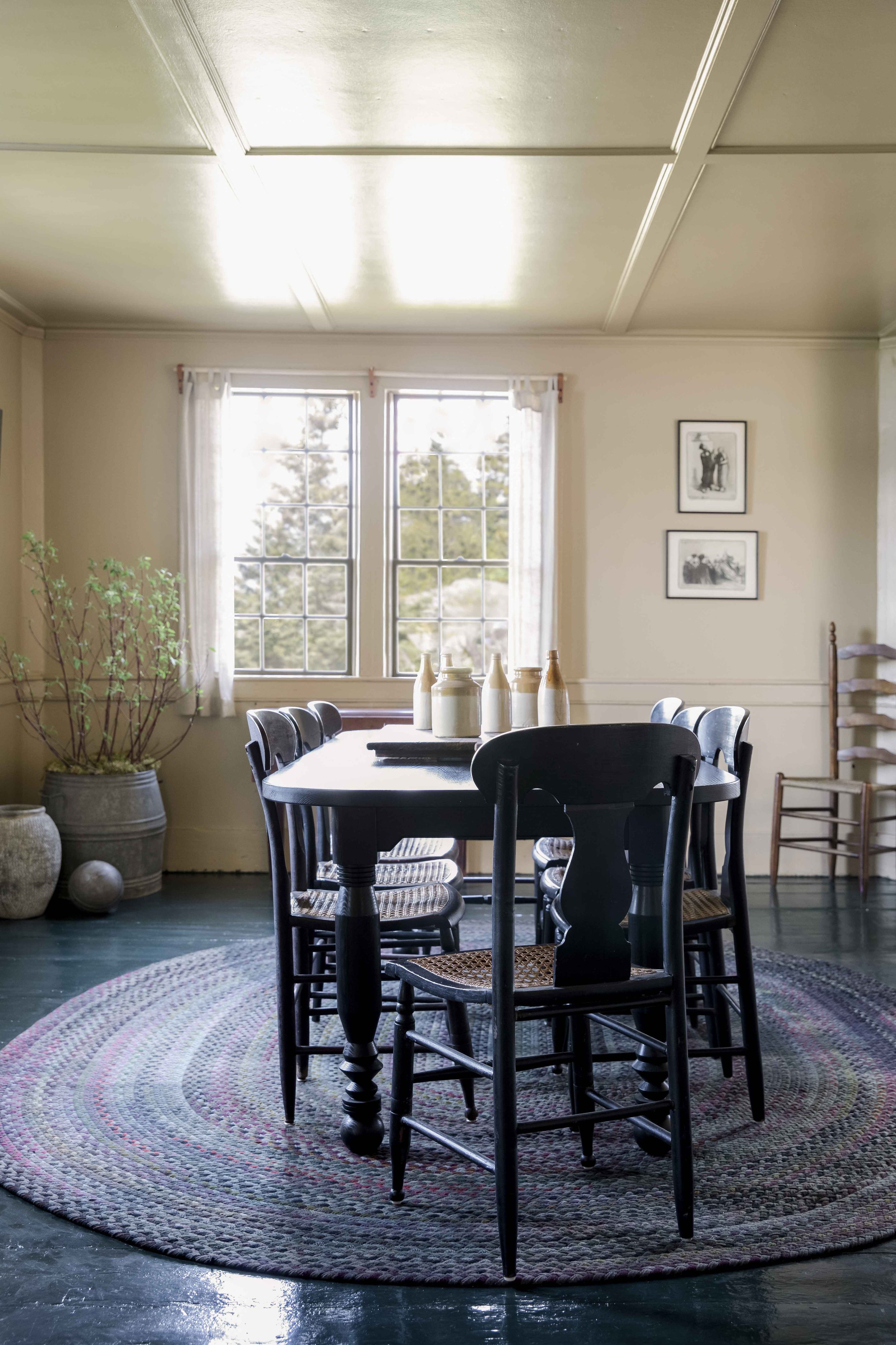
We like to think that every room has a focal point or “main character” — the show-stopping piece that commands your attention right away, and our “NBL” table is just that. It goes without saying the proportions of the original dining space gave us some parameters to design within. This is not a large room at all so a rectangular dining table would have cut into the walk-around/buffer space and a round table would have been far too wide and informal feeling. An oblong, oval-shaped table made the most sense in terms of visual appeal and functionality in this space. Once we had our proportions and shape ironed out, we were left feeling like it needed a little something to jazz it up! We definitely had fun with these leg turnings and the way this custom brewed stain makes the grain of the wood pop is giving us butterflies. The black cane chairs were too pretty to pass up and went wonderfully with the table. They look as though they’ve always been together which is exactly what you want when you’re mixing and matching antiques.
Note: For those of you wondering, “NBL” stands for “Nothing But Legs” and by looking at the photos, you’ll see what we mean. Simple tables are great and all, but as designers we’re here to add something unique to whatever we touch.
The cottage had a ton of large braided wool rugs that were still in really good condition. We’ve been hard-wired by our Dad to get creative with what we have so we racked our brains for some way to add these into the final space without it feeling too old. We loved the textured braided pattern, but not all the colors that clashed with the half-baked material palette we had at the time. We rolled through lots of ways to “mute” some of the more vibrant colors from coffee staining, to bleaching & re-dying, to simply over-dying. After a little research and asking around we decided over-dying would probably give us the best results! It took a few rounds of DIY trash can-over-dying to achieve the desired shade of green seen here.
This built-in bookshelf connects the dining room to the morning room so we didn’t want to overload her — she just needed a few vintage goodies to add some warmth. Last but not least, we need to call out the addition of this interior window. We love adding these in because they let light in from other rooms and also allow for a little peek-a-boo from room to room. *This window in particular joins the dining with the kitchen which we have yet to show — we like to save the best for last! And with a cliffhanger like that, we’ll be back in the new year with a few big project reveals to get a jump on 2022. For now head over to our design site to see what’s coming soon. We wish you a happy holiday season and a healthy New Year!
P.S. Have you watched our episode on Magnolia network’s “Point of View: A Designer Profile” (specifically season 2, episode 5) yet? If you’ve already seen it, then maybe it’s time to book your next getaway with us.
Get Moore House directly in your inbox [ SUBSCRIBE ]
Images: Erin McGinn Photography


The Roweam Earthenware Collection is rooted in reverence for the natural world—a grounded celebration of texture, form, and sustainability. This curated offering honors the quiet strength of the earth, featuring hand-hewn woods, sun-warmed ceramics, and raw, time-worn materials that echo ancient landscapes. Designed to elevate interiors while paying tribute to the places that inspire them.