Moore Thoughts on Art…
So we know we talked about our approach gallery walls recently, but we wanted to answer some more commonly asked general art questions too. It’s such an important part of the design work we do—providing endless inspiration to our interiors—but it really seems to stump people. But great news! It’s so much easier than you think. From where and how to hang it, to the best spots to buy art for your home, we’re sharing some of our favorite tips and resources. So prepare to be inspired!
Some inspiration…
Gallery walls are common, but they’re not the only game in town! Don’t feel like you need to fill up an entire wall with art. Sometimes it’s really fun to just let a piece breathe on its own. Let it be a statement in a room. Here are some different ways to think about where and how to hang artwork.
An oversized piece of art
Obviously scale is really important here, you never want to put a postage stamp sized piece of art on a massive wall. But like the art on the right, you can see how a larger size works beautifully in a room. Especially because the colors in this piece contrast nicely with the rest of the neutral room. It’s the first thing your eye goes to in the space. If you have a really special piece that feels dynamic and interesting, don’t be afraid to let it stand on its own!
Have fun with it.
Don’t save art for just the living room. We’re fans of incorporating it just about anywhere. Kids rooms, bathrooms, hallways, and kitchens, there’s no place that the right piece of art doesn’t belong. Also, thematically don’t feel like you can’t a “serious” piece of artwork somewhere unexpected.
Try a group of three.
Three is a friendly number, odd numbers look great together, and they can help you fill an awkward space. A group of one large and two smaller pieces look great on a smaller wall space, or tucked into a corner with an accent chair and a sculptural floor lamp.
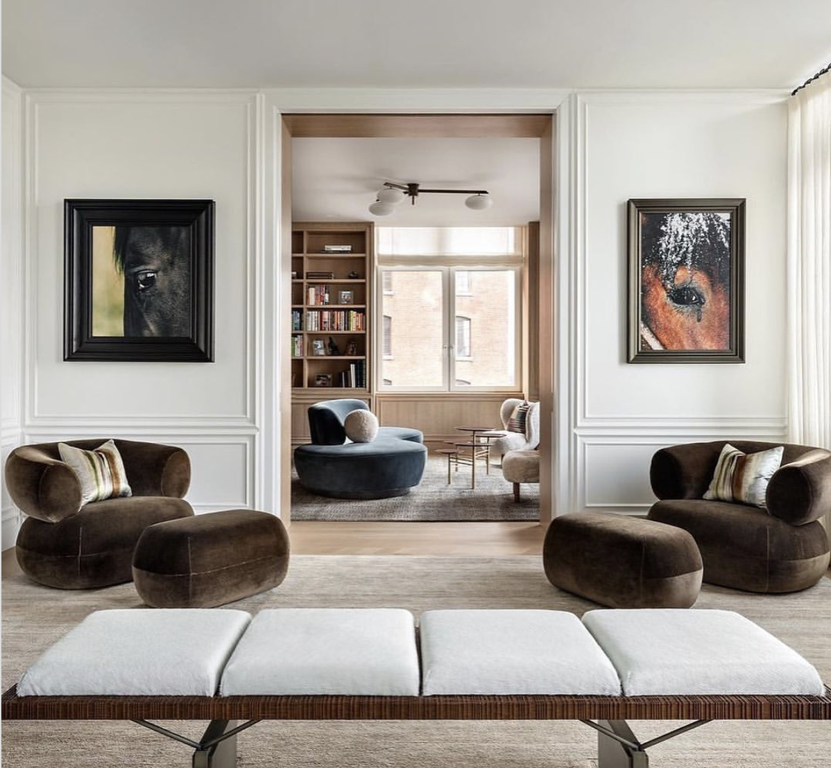
Hanging a pair of paintings.
Two can be an awkward number on a wall, but we love how playful these two horse paintings look in this room. They perfectly complement the doorway and help draw your eye to the cool peek-a-boo moment happening with the next room. When it doubt, if you have the wall space, you can never go wrong with hanging two similar sized pieces right next to one another.
Photo by Thomas DeBruyne/ @cafeine for Beta-Plus Publishing.
Marie Christine Design/ Photo by: Joshua McHugh Photography
Marie Christine Design/ Photo by: Regan Wood Photography
Some of our favorite artists/shops…
Catherine Druken is the Rhody based artist behind Lovici Creative. She does a lot of really lovely line work creating facial forms and nudes, we love putting both in our bathrooms and in gallery walls. She also takes commissions!
Follow her on IG here.
Sam Kupiec is an LA-based artist who creates neutrally colored, textural, and abstract artworks rooted in minimal compositions. We love that her work is accessible and her mastery of neutrals.
Follow her on IG here.
Chelsea Fly is a landscape and abstract artist located in Memphis. She really plays with size in her work and what’s great is that she has a lot of smaller pieces. They’re perfect for filling in a gallery wall or awkward space.
Follow her on IG here.
Christian Hetzel is a contemporary artist from outside of Stuttgart, Germany. His work is abstract and incredible, again lots of tone-on-tone and neutral colors. He also has some prints available too.
Follow him on IG here.
The Fine Store has modern & minimalist prints available from Hein Studio, a design studio in Copenhagen, specializing in high quality Nordic design. With an interest in sustainability and a commitment to craftsmanship, the company is founded by creative director, Rebecca Hein Hoffmann.
Follow them on IG here.
Header image: Erin Little Photography


The Roweam Earthenware Collection is rooted in reverence for the natural world—a grounded celebration of texture, form, and sustainability. This curated offering honors the quiet strength of the earth, featuring hand-hewn woods, sun-warmed ceramics, and raw, time-worn materials that echo ancient landscapes. Designed to elevate interiors while paying tribute to the places that inspire them.